![[NB] Creative Futures CIC](http://images.squarespace-cdn.com/content/v1/68c276df7928f778938222f2/98488c41-8030-41a8-b1b4-ee4c899d7119/NBCF+BRAND+MASTER+copy-16.png?format=1500w)
FINDING NEW BRIGHTONIntroduction and Background
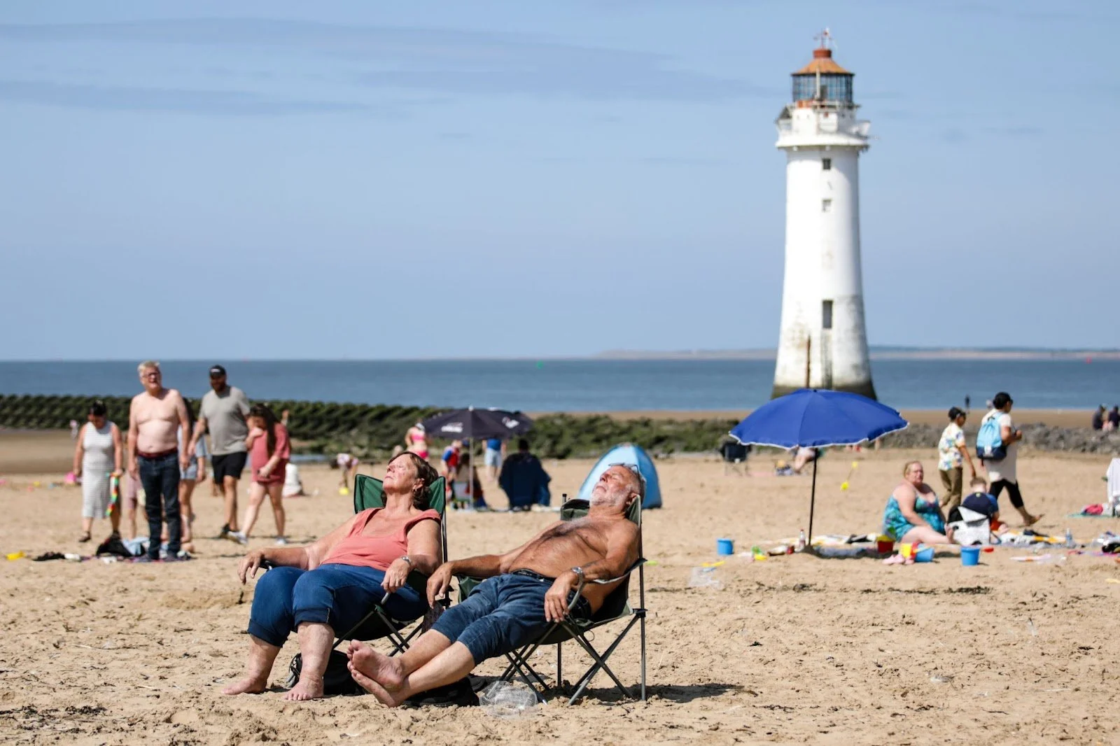
New Brighton, located at the northeastern tip of the Wirral Peninsula, is a historic seaside town with distinct zones – from its Victorian-era promenades and lighthouse to modern retail and leisure hubs.
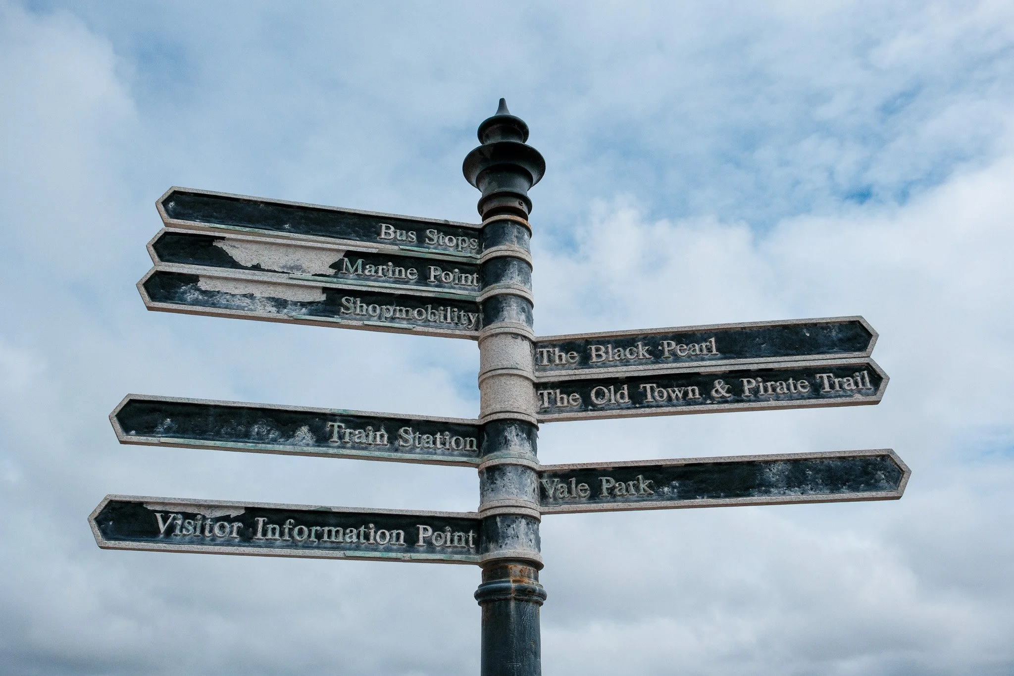
Currently, New Brighton’s way-finding landscape is fragmented and dated, with ad-hoc signs and notice boards (some in disrepair) that lack a unifying design or clear navigational information. For example, community notice boards meant to display “What’s On” are often empty or tattered, reflecting the need for better-maintained, informative signage.
These disjointed elements make it challenging for visitors and even residents to fully explore the town’s diverse quarters – including its independent retail streets (e.g. Victoria Road “Victoria Quarter”), hospitality and entertainment venues, cultural sites, and coastal attractions. There is a clear opportunity to introduce a cohesive, visually distinct wayfinding system that connects these areas and enhances New Brighton’s identity.
Objectives
The proposed initiative will establish a unified signage, wayfinding, and branding system across New Brighton.
The goals are to improve navigation (so that a first-time visitor can easily find beaches, the Floral Pavilion theatre, the shopping streets, etc.), to create a stronger sense of place through consistent design, and to encourage movement between the town’s key destinations.
By seamlessly linking the retail quarter, the waterfront promenade, the leisure park (Marine Point), historic sites like Fort Perch Rock, and emerging creative hubs under one design language, the wayfinding system will address current challenges and unlock new opportunities. Improved links between these character areas are expected to increase footfall across the whole town rather than concentrating visitors in one spot. In short, a cohesive wayfinding system will not only help people find their way, but also tell New Brighton’s story and invite them to discover more of what the town offers.
Executive Summary
Linking Place, Movement and Identity in New Brighton
The problem
New Brighton is not short of assets. It is short of connection.
Visitors struggle to navigate between key areas:
promenade and beach
Marine Point
Victoria Quarter
heritage sites
Signage is inconsistent, outdated, and often absent.
Result: limited exploration, reduced dwell time, and missed economic value.
The opportunity
A cohesive wayfinding system can:
increase visitor movement across the town
extend dwell time
drive spend into under-visited areas
strengthen New Brighton’s identity
This is not signage. It is economic infrastructure.
The solution
Implement a unified wayfinding and branding system that connects the town physically and narratively.
Core components:
Clear navigation
Orientation maps at key arrival points
Directional signage with walking times
Defined routes linking major destinations
Distinct identity
Consistent visual system (colour, typography, iconography)
Recognisable New Brighton brand across all touchpoints
Movement strategy
Designed visitor journeys (station → promenade → Victoria Road → Marine Point)
Redistribution of footfall across the town
Storytelling layer
Heritage and cultural content embedded into signage
Reinforces sense of place and visitor engagement
Digital extension
QR-enabled maps and lightweight mobile experience
Event and local business visibility
Priority interventions (Phase 1)
Focus on high-impact, low-complexity moves:
Gateway signage at:
New Brighton Station
Marine Point
Core pedestrian route:
Station ↔ Promenade ↔ Victoria Quarter
Town-wide map system:
“You are here” panels
Walking times
Initial brand rollout:
visual identity applied consistently
Expected outcomes
Economic
Increased dwell time
Higher visitor spend
Improved distribution of footfall
Place
Stronger, more coherent identity
Improved visitor confidence and experience
Community
Increased civic pride
Better visibility for local businesses and culture
Why this matters now
New Brighton is already regenerating.
But it behaves like disconnected parts, not a single destination.
Wayfinding fixes that.
It turns:
places into a network
visits into journeys
footfall into spend
Recommendation
Proceed to:
Establish a project steering group
Commission detailed design and location planning
Secure Phase 1 funding
Deliver pilot ahead of peak season
This is a practical, visible intervention with immediate impact and long-term value.
Clear direction creates movement. Movement creates value.
Understanding Wayfinding and Placemaking
Defining Wayfinding, Placemaking, and Branding
Wayfinding refers to the strategies and tools that help people navigate and orient themselves in physical space. It is more than just putting up directional signs – it involves planning how people move through an environment and providing clear information at decision points. An effective wayfinding system “effortlessly guides [people] from where they are to wherever they wish to be,” minimizing confusion and stress. Studies show that a well-designed wayfinding plan fosters comfort and trust among users by reducing uncertainty in their journeys. In essence, wayfinding is about creating a legible environment where visitors can form a mental map and feel confident as they explore.
Placemaking is a broader concept that focuses on the experience and atmosphere of a place. It involves designing the physical environment and public spaces in a way that is welcoming, engaging, and reflective of local culture. Placemaking is the process of “curating and sculpting a place into an environment meant to attract, retain, and delight a certain audience”. This could include public art, landscaping, landmarks, and social spaces that together create a strong sense of place. In a placemaking context, wayfinding elements are not just functional but also contribute to the character and story of the location. For example, signage and gateways can serve as symbols of a town’s identity, becoming landmarks that residents pride in and visitors photograph. Effective placemaking fosters emotional connection – people feel attached to places that tell a story and offer memorable experiences.
Branding (in an environmental and urban context) refers to the creation of a unique visual identity and narrative for a place. It’s about conveying what is special about a town or district – its heritage, values, and vibe – through design elements like logos, color schemes, typography, and slogans, and applying this identity consistently across various media and infrastructure. In physical spaces, branding often overlaps with wayfinding through what experts call “branded environments.” A strong brand identity “forges a powerful community centered around a common mission,” and when expressed throughout the environment, it unifies disparate buildings and spaces under one story. This might be seen in banners, informational signs, murals, and even street furniture bearing a town’s logo or thematic motifs. Branding gives a place recognizability and helps people emotionally connect with it – think of how certain cities are immediately associated with specific fonts, colors, or icons (for example, the London Underground roundel or New York’s subway typography).
While these three concepts differ – wayfinding is about navigation, placemaking about creating a vibrant space, and branding about identity – they strongly interrelate. In modern urban design, integrating wayfinding, placemaking, and branding is considered best practice for creating places that are not only easy to navigate but also enjoyable and memorable to experience. A cohesive wayfinding system can serve as an extension of a community’s brand identity, reinforcing what makes the town unique at every turn. Likewise, placemaking efforts (like public art or historical markers) can be folded into the wayfinding system to provide “visual storytelling” – giving directional signs or maps an added layer of meaning that reflects local heritage and culture.
Wayfinding’s Role in Community Pride, Economic Vitality and Experience
An effective wayfinding system does more than get people from Point A to B – it actively contributes to a town’s social and economic well-being. By making navigation intuitive, wayfinding reduces visitor frustration and improves overall experience, which in turn encourages people to spend more time (and money) in an area. A recent study of city wayfinding found that clear signage and maps kept people in town longer and led them to explore more businesses, directly translating to increased spending at local shops, restaurants, and attractions. In short, better navigation = longer visits = higher economic activity.
Consistent, attractive signage can also promote local pride When a town invests in its appearance and ease of use, residents feel valued and visitors sense that the community cares about its identity. For New Brighton, a town with a proud history (once home to Britain’s tallest tower and a bustling resort), highlighting heritage through branded wayfinding can rekindle locals’ pride in their hometown’s story and uniqueness. At the same time, it signals to visitors that New Brighton is forward-looking and welcoming, not a place stuck in decline. Wayfinding elements often become talking points – for instance, distinctive fingerposts or map kiosks can be seen as “icons” of the town that residents point out with pride.
Wayfinding is closely tied to placemaking in that it helps knit together different parts of a town into one cohesive “place” in the minds of users. Urban planner Kevin Lynch, in The Image of the City (1960), noted that people form mental maps of cities based on key elements (paths, edges, districts, nodes, landmarks)slate.com. A legible wayfinding system builds on those elements – for example, highlighting landmarks and distinct districts on maps and signs – to make the city more readable and navigable. This “legibility” is crucial for New Brighton, which has several disparate quarters (waterfront, shopping street, leisure center, etc.). By “stitching together the city” with a consistent sign network, the wayfinding system can give a fragmented town a more unified identity. Visitors experience the town as an interconnected whole rather than isolated pockets, which enhances the sense of place and encourages exploration beyond a single attraction.
Moreover, visual storytelling through themed design and information can deepen visitor engagement. Wayfinding signage offers an opportunity to share local stories, art, and culture in small bites – for instance, an informational panel directing people to the promenade might also note that New Brighton once had Europe’s largest open-air swimming baths, or include a historic photo of the old pier. These touches turn a walk into a learning experience, fostering appreciation for the town’s heritage. Studies by tourism boards have shown that when visitors feel more informed about a destination’s history and offerings, they report a more satisfying experience and are more likely to recommend the place to others. By telling New Brighton’s story at the street level – from pirates and Fort Perch Rock to the recent creative revival on Victoria Road – the wayfinding system can create a richer, more memorable visit, translating to positive word-of-mouth and repeat visits.
Finally, integrating branding and wayfinding supports economic vitality by distinguishing New Brighton in a competitive tourism market. A cohesive brand conveyed through signage can make the town more memorable and marketable. As one destination development firm notes, “Wayfinding signage is more than just pointing directions—it’s a strategic tool for strengthening local economies”, because it highlights key assets and “connects [visitors] intuitively with places they may not yet know exist”. Strong visual branding and storytelling via signage create a sense of place that encourages repeat visitation and attracts investment (new businesses are more likely to open in a town that looks well-cared-for and frequented by visitors). In summary, effective wayfinding and branding can boost New Brighton’s profile, making it not just easier to navigate, but a more attractive place to shop, dine, and spend leisure time – benefiting the community and economy alike
Case Studies and Best Practices
To inform New Brighton’s wayfinding and branding strategy, this section reviews best-practice examples from a range of places – from other UK seaside towns and small creative communities, to big cities and transit hubs known for exemplary navigation systems. Each case offers insights relevant to New Brighton’s scale, coastal environment, and ambitions.
Seaside Towns: Reviving Coastal Identity through Wayfinding
Margate (UK)
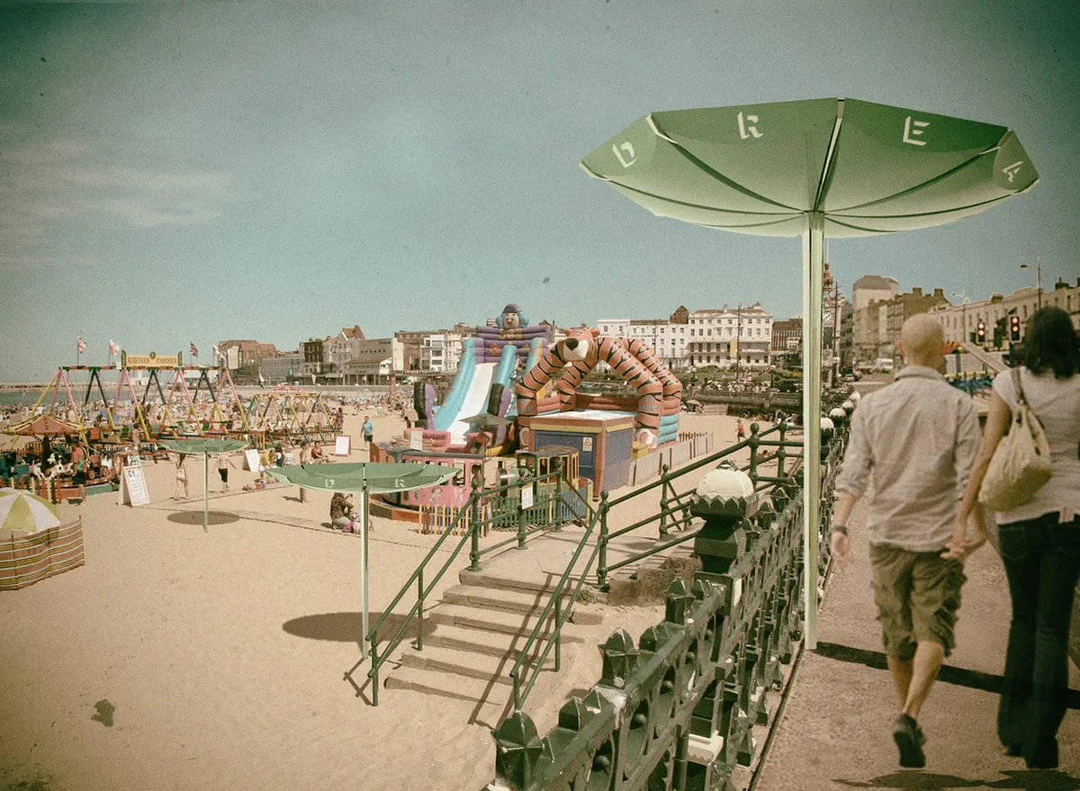
Margate, a seaside town in Kent, has reinvented itself as an arts and culture destination over the past decade. A key part of its resurgence was establishing a strong identity blending retro seaside charm with contemporary art – epitomised by the revival of the Dreamland amusement park. While Margate’s signage is relatively traditional in terms of directional signs and brown tourist attraction signs, the town embraced branding in the public realm.
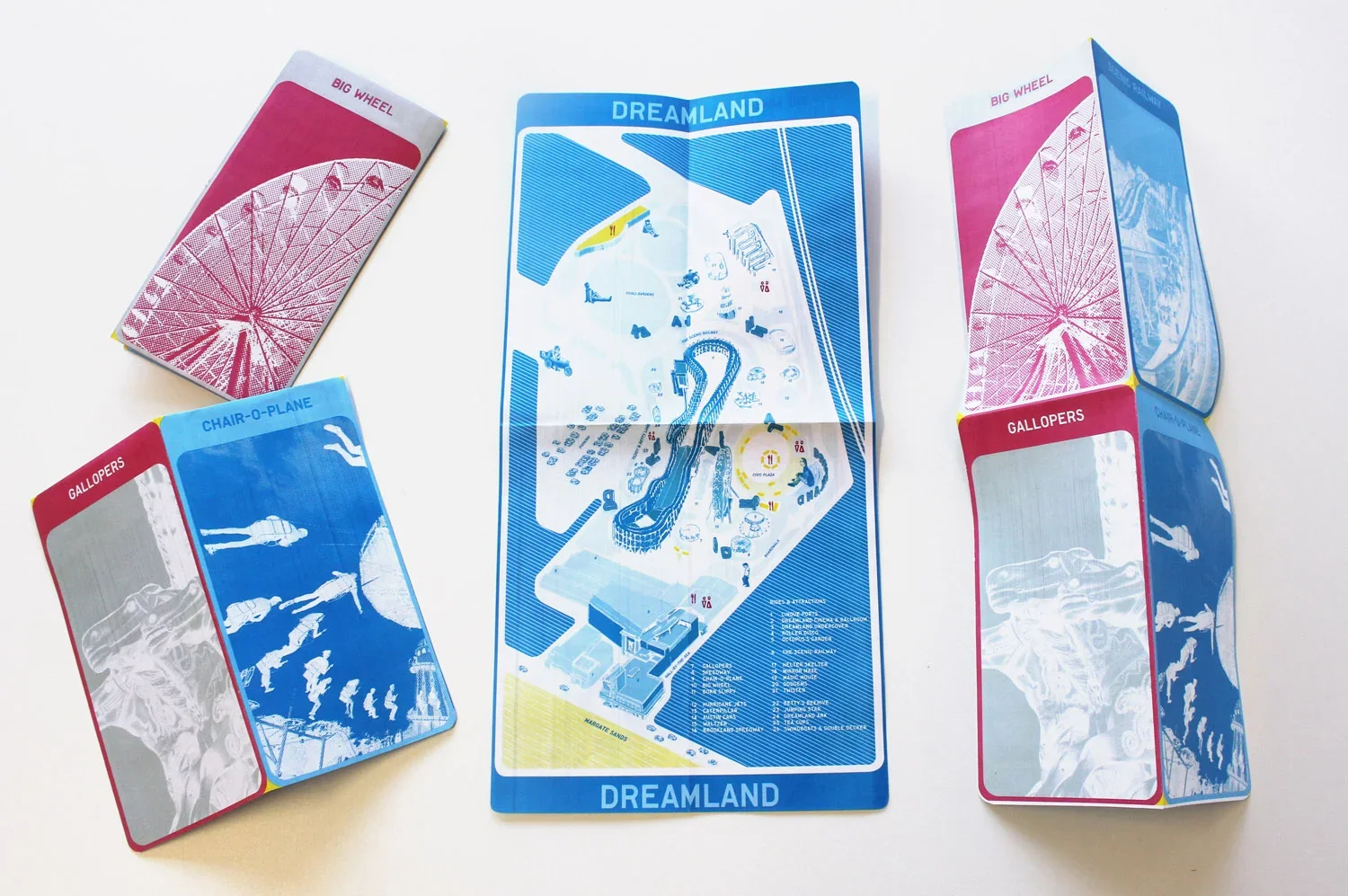
Bold, colourful signage for Dreamland (in a vintage typography) and improved pedestrian signage around the Old Town and Turner Contemporary gallery have helped visitors navigate between the seafront and town centre.
The lesson from Margate is the importance of visual consistency and storytelling: Dreamland’s wayfinding within the park, designed by Spaceagency, uses retro-inspired graphics that reinforce Margate’s nostalgic funfair vibe. New Brighton, similarly, can draw on its vintage seaside heritage – perhaps using stylised fonts or colours reminiscent of its 19th-century pleasure gardens – while guiding people along the waterfront, to the art installations on Victoria Road, and so on. Even simple gateway signs can make an impact; Margate’s seafront now greets visitors with a prominent “Margate” neon-style sign, instantly conveying a sense of place.Whitstable (UK)
Whitstable, a smaller coastal town famous for its oysters and maritime history, has implemented people-centric wayfinding on a modest scale. Recognising that many visitors arrive by car or bus and then explore on foot, local authorities (with support from Swale Borough Council) have been installing pedestrian information boards and fingerposts as part of a wayfinding project. Phase 2 of this project, for example, added signs across the town to help newcomers find the picturesque Harbour, High Street shops, and museum.
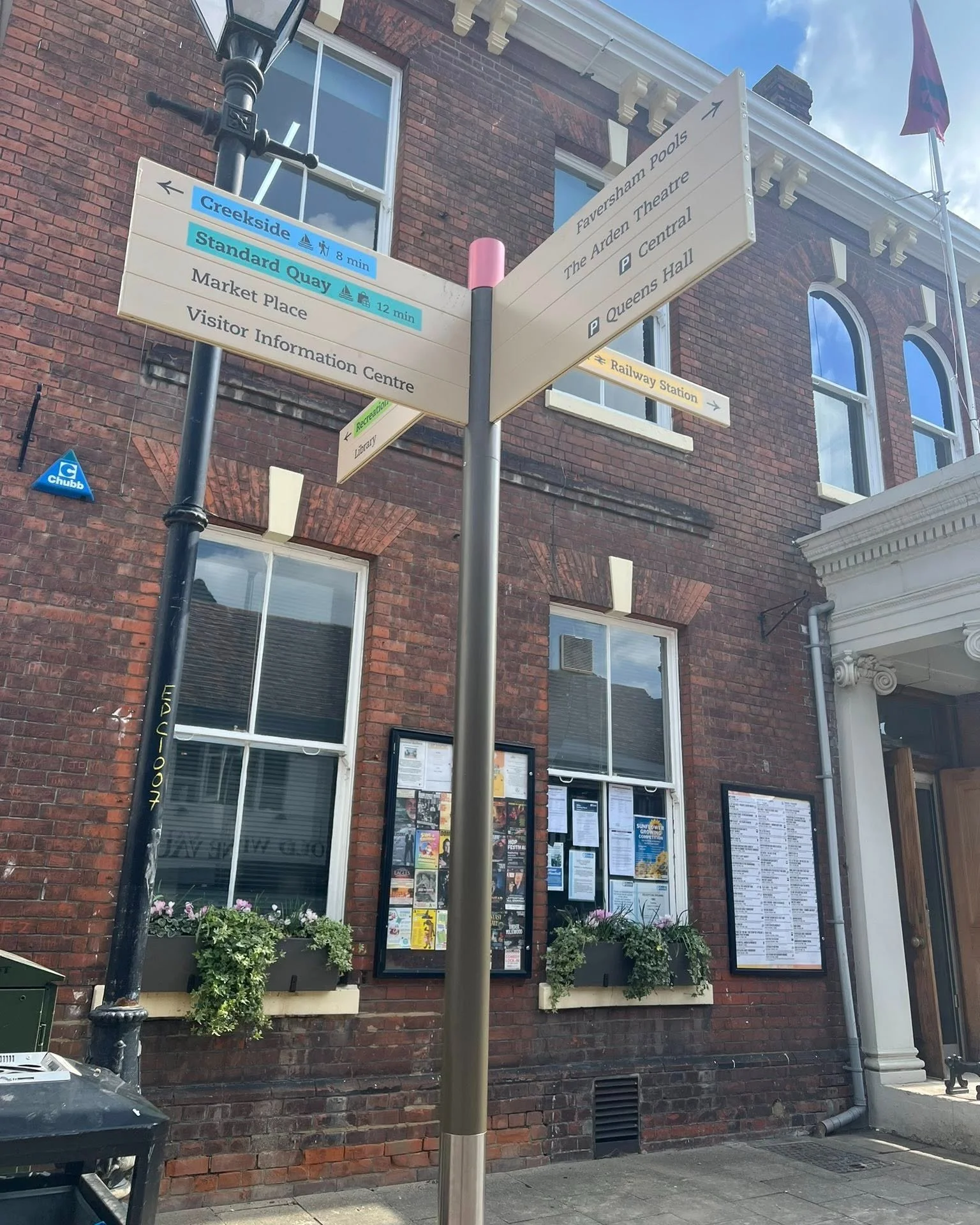
The signage also includes walking times, encouraging visitors to stroll rather than drive between the town’s attractions. Whitstable’s approach underscores a best practice for any town: make the town walkable with clear pointers, and highlight the “hidden gems.” A sign might not only say “Harbour – 5 minutes →” but also mention the Oyster Festival or an iconic pub along the way, piquing interest.
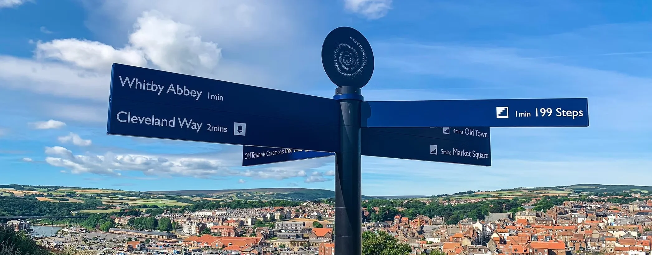
For New Brighton, which similarly has a compact area that is best explored on foot (from the promenade to cafes on Victoria Road), a network of pedestrian signs with estimated walking times could significantly improve visitor flow. This approach demystifies distances – a lesson from London’s Legible London project was that people often overestimate distances and default to vehicles or not venturing at allslate.comslate.com. Showing that, say, “Marine Lake – 3 minutes” or “Station → 7 minutes” on foot maps will encourage exploration and reduce car use within the town.Brighton (UK)
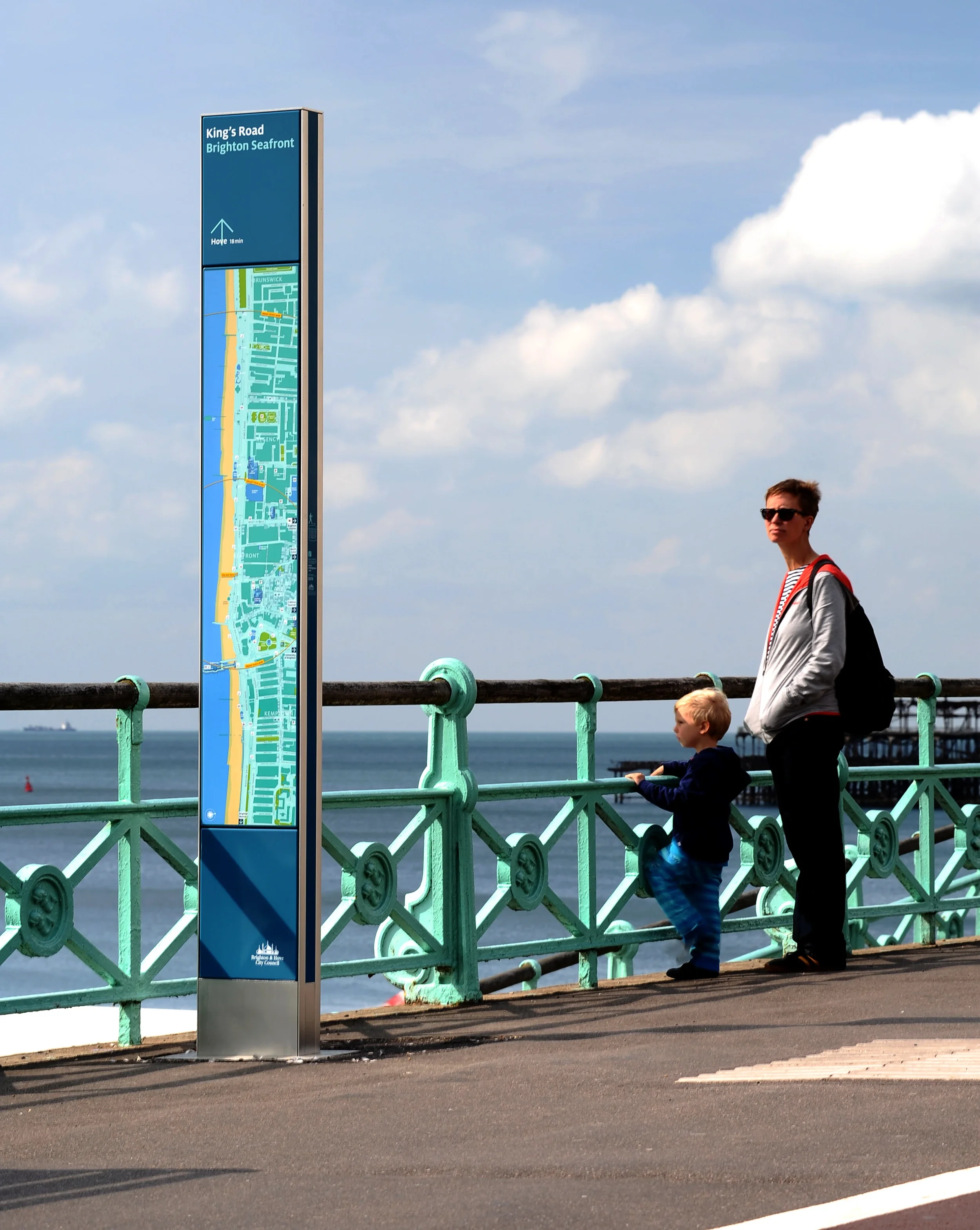
The city of Brighton & Hove offers a strong example of integrating branding with wayfinding on a large scale. Branded as “Walk Brighton,” the city’s pedestrian wayfinding system was developed as a comprehensive strategy by Applied Information Group for the council. At its core is a master map of the city that reflects Brighton’s distinct personality – creative, vibrant, independent – by using a consistent graphic style, color palette, and even playful iconography of local landmarks.
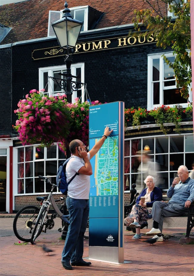
This map underpins all mediums: it appears on elegant monolith signs on the streets, on printed walking maps, in visitor brochures, and even in a mobile app called WalkBrighton. The on-street signage (similar to London’s Legible London totems) features heads-up orientation maps (rotated to face the user’s direction of travel) and concise directional pointers, all styled in Brighton’s brand colors and typography. The success of Brighton’s system lies in how it builds trust and recognition – because the mapping and design are instantly recognizable, people feel confident using it anywhere in the city, and it reinforces a sense of place with every use.
Key insights for New Brighton from Brighton’s case are: (1) Develop a unifying map style that can be reused from signs to brochures to digital, so all navigation tools “speak the same language” and strengthen identity; (2) reflect local character in the visuals (Brighton’s maps hint at its quirky arts scene; New Brighton’s could incorporate, say, a maritime motif or a subtle lighthouse icon on the map); and (3) consider digital integration – Brighton complemented physical signs with an app for those who prefer phones. Notably, Brighton’s approach also demonstrates the value of consistent maintenance and updates. Having one central “master” makes it easier to update information across all platforms, ensuring accuracy.Bournemouth (UK)
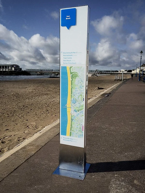
A popular resort town, Bournemouth faced the challenge of guiding tens of thousands of summer tourists between its beaches, gardens, and town center. While not as celebrated for a branded system as Bristol or Brighton, Bournemouth has implemented clear, color-coded signage in key areas. For example, different beachfront zones are marked with distinctive colors and icons (family beach vs. surfing zone), and public path maps are placed at entrances to the pier and gardens.
The local council’s investment in wayfinding, including informative lecterns (map stands) produced by firms like Kent Stainless, has been aimed at encouraging visitors to explore beyond the seafront – such as finding the Russell-Cotes Art Gallery or the town’s shopping arcade. The lesson from Bournemouth is the importance of hierarchy in signage: major totems or gateway signs at arrival points (parking lots, transit stops) give an overview, while smaller directional signs lead to specific venues.
New Brighton should emulate this by placing large orientation maps at gateways (e.g., outside New Brighton train station and at Marine Point’s parking area) and then use fingerposts within the town for finer navigation. Additionally, Bournemouth’s use of consistent graphic motifs (e.g., wave symbols on signs) shows how a theme can tie the system together.St. Ives (UK)
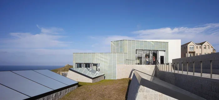
St. Ives in Cornwall is a quaint town of winding lanes, but with world-class attractions like the Tate St. Ives art museum. Managing visitor flow through its narrow streets has been critical. St. Ives introduced a pedestrian wayfinding scheme that included discreet yet legible signage blending into the historic environment. For instance, wall-mounted direction signs in the town’s characteristic blue colour point to the Harbour, Tate, and beaches. There are also themed walking trails (e.g., “heritage trail”) marked by symbols on signposts. The key takeaway is balancing functionality with aesthetics in a heritage setting.
New Brighton has some historic elements (Victorian buildings, the Fort) and any new signage in those contexts should be sympathetic (perhaps using traditional-looking signposts or materials like cast-iron for heritage zones, versus more contemporary designs in the modern retail park). St. Ives also highlights the use of interpretive panels as part of wayfinding – small plaques that not only direct but also inform (for example, pointing out where famous artists lived or where certain views were painted). Such storytelling could be emulated in New Brighton, adding depth to the experience (e.g., a sign near the Queens Royal could mention the heyday of New Brighton’s amusement grounds).Scarborough (UK)
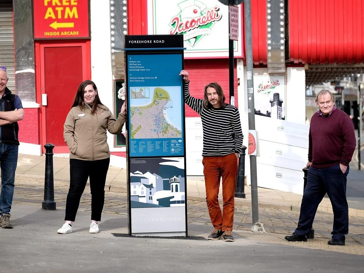
Scarborough, another classic English seaside resort, recently undertook a comprehensive wayfinding upgrade as part of a post-Covid town center revival. In 2021, the town installed new pedestrian totems and fingerposts throughout the seafront and town centre, as well as a “cultural quarter,” to better connect its attractions.
The totems feature local area maps, walking distances, and importantly, integrated digital support: they are complemented by interactive digital kiosks and a custom wayfinding smartphone app. The app offers guided trails and even interactive games themed on Scarborough’s heritage to encourage visitors to explore beyond the obvious hotspots. The physical signage itself carries design elements that celebrate Scarborough’s identity – Placemarque (the design firm) incorporated artwork on the monoliths reflecting Scarborough’s status as Britain’s first seaside spa resort (e.g., imagery of historic bathing machines or spa architecture).
Community input shaped the content, ensuring local cultural sites like the Rotunda Museum and art gallery were highlighted, not just the beach and amusement arcades.
The insights for New Brighton here are rich: (1) A multi-modal approach – use physical signs for instant guidance but amplify with digital tools for depth. New Brighton could, for instance, have QR codes on signs linking to audio snippets of local history or an events calendar app. (2) Storytelling through design – just as Scarborough printed historical art on their signs, New Brighton’s could feature, say, vintage postcard graphics or a silhouette of the old New Brighton Tower, thereby turning signs into conversation pieces that connect people to local heritage. (3) Partnership and funding – Scarborough’s scheme was a joint initiative of the Borough Council, Town Centre Team, and Town Deal funding board. This shows the value of aligning a wayfinding project with broader regeneration funding (Town Deal is analogous to the UK’s Levelling Up Fund). New Brighton’s project could similarly be pitched as a key to “build back” the visitor economy, especially after the pandemic, by promoting all the town’s offerings. Early results from Scarborough indicate the approach is well-received: officials noted the signs “provide important local information” and, combined with the app, “promote more of what Scarborough has to offer”, thereby supporting a stronger tourism economy.Scheveningen (Netherlands)
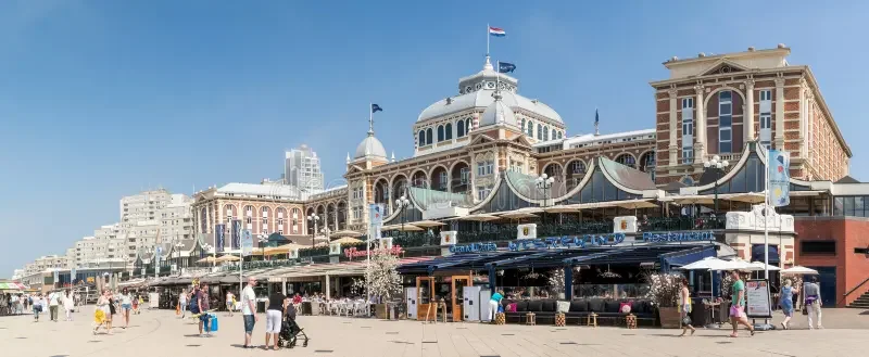
Scheveningen, a coastal resort district of The Hague, provides an international example. As a seaside locale that attracts both domestic and international visitors, Scheveningen’s wayfinding is notable for being multilingual and pictogram-driven. The beach area uses universal symbols (for beach, pier, aquarium, etc.) on its signs, alongside Dutch/English text, ensuring non-Dutch speakers can navigate easily. Bright, large-format signage along the promenades direct people to amenities like the Kurhaus (grand hotel), pier, and sculpture museum, all while maintaining The Hague’s city-wide branding style.

A playful touch in Scheveningen is the use of public art as wayfinding – for example, a series of cartoon-like sculptures (the “SprookjesBeelden” by American artist Tom Otterness) line the boulevard and lead visitors toward the museum area. This blurring of art and wayfinding creates a whimsical visual cue: people follow the sculptures (which effectively act as landmarks) as much as they follow the signs.
For New Brighton, which already has some public art (e.g., the pirate ship bench, the mural artworks on Victoria Road), this suggests integrating art with signage. Perhaps sculptural signposts or artist-designed maps could both beautify and guide – fitting for a town that values its creative community. Additionally, Scheveningen’s approach to seasonal wayfinding is instructive: during major events or construction, temporary wayfinding is deployed (often designed by Mijksenaar’s firm) to keep visitors informed and safe. New Brighton may consider flexible signage for peak summer events (like pop-up info boards during festivals or a different parking routing when certain roads close for events).Monterey (USA)
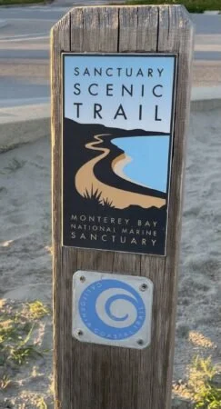
Monterey, California, is a seaside city known for its historic Fisherman’s Wharf, Cannery Row, and world-famous aquarium. Like New Brighton, Monterey has distinct areas (a downtown, a waterfront tourist zone, beaches, and cultural sites) spread along a coast. Monterey implemented a comprehensive wayfinding signage program to unify these areas. The system includes coordinated vehicular signage (directing drivers to parking and districts) and pedestrian signage (maps and directional posts for walkers), all designed with a cohesive look and the city’s brand elements. For example, signs pointing to “Cannery Row” (a once industrial area turned tourist district) feature an industrial-modern design with silhouettes of sardine fish – a nod to Monterey’s fishing history – reinforcing the character of that district even as you navigate.
The pedestrian kiosks near Fisherman’s Wharf include illustrated area maps highlighting key sights and “you are here” markers. Monterey’s approach highlights the importance of connecting transit points to attractions: they placed many signs around the transit plaza and waterfront parking areas, with clear arrows to the Wharf, Aquarium, etc., so that from the moment visitors arrive, they know where to go. Furthermore, Monterey’s system was designed to be expandable – it’s part of a regional wayfinding plan for the whole Monterey Bay area, meaning the signage style can extend to neighbouring towns for a seamless visitor experience.
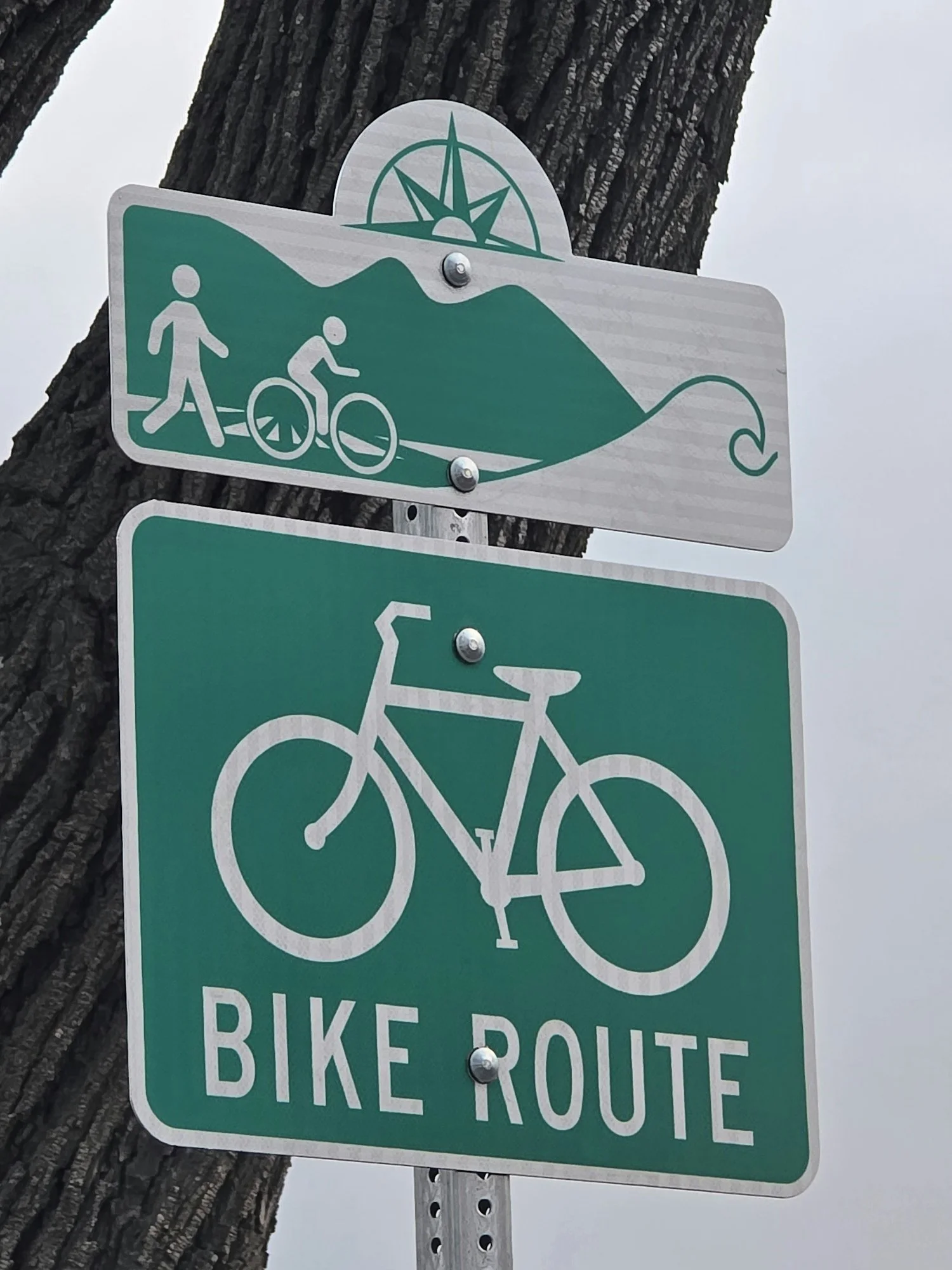
For New Brighton, working within a regional context (Wirral or Liverpool City Region) could be beneficial; e.g., ensuring the design is compatible with signage in nearby areas or at transport hubs like Lime Street or Liverpool ferry terminals, so a visitor’s journey is smooth end-to-end. Lastly, Monterey recognizes different modes: their plan covers bike and pedestrian wayfinding along coastal trails. Given New Brighton’s coastal promenade is popular with walkers and cyclists, incorporating cycle route signs (pointing to NCN cycle routes or the Wirral Coastal Park trail) into the system would emulate this best practice.Small Town Successes: Character and Community at the Forefront
Frome (UK)
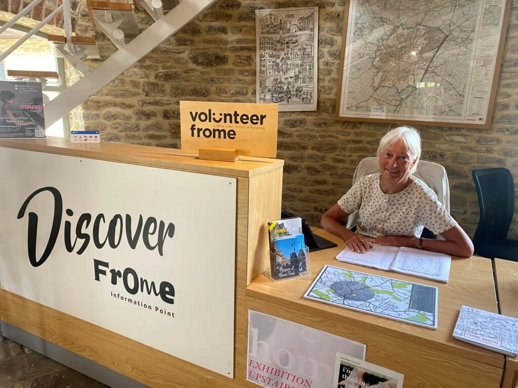
Frome in Somerset is a market town renowned for its independent spirit and successful regeneration of its town centre. Although not on the coast, Frome offers lessons in how a strong local identity and community-driven approach can inform signage. The town uses the slogan “Frome – A Town Alive” and has a distinctive visual identity (including a town crest and a consistent color scheme on public materials). Wayfinding in Frome includes rustic fingerpost signs in the town’s palette, pointing to the marketplace, historic sites, and cultural venues. Notably, Frome’s community has a say in these matters – a few years ago, a prank highlighted this when the “Welcome to Frome” road sign was mysteriously moved to a different town, causing an uproar and quick action to replace it. This anecdote underscores how much the community valued their town’s sign and identity.
For New Brighton, engaging the community early (perhaps through the New Brighton Partnership’s networks) in designing the look and messages of the signs can build buy-in and ensure the signage reflects what locals feel is unique about their place. Frome’s success in revitalization suggests that even small touches – like a nicely designed welcome sign or informational plaques about local artisans – can contribute to a cohesive brand that both residents and visitors respond to.Totnes (UK)
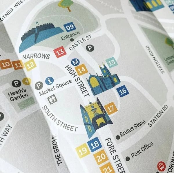
Totnes, in Devon, is famous for its bohemian vibe, sustainable ethos, and well-preserved heritage main street. In 2021, Totnes Town Council launched a wayfinding improvement project in response to long-term feedback that existing signage was “confusing and insufficient”. Consultants audited the town’s signage and found that many visitors were not finding all the town’s offerings. The resulting strategy focuses on ensuring “visitors discover everything the historic town has to offer” and prioritizes walking routes. The recommendations for Totnes included using a mix of off-the-shelf and bespoke sign types that can adapt to different parts of town (for example, a contemporary style near the modern civic square and more traditional style in the medieval lane).
Importantly, they aim to create an experience where visitors have a “relaxing, fulfilling and enjoyable” time, leading them to spend more time and money locally and leave “feeling better informed about the area’s history and heritage, local businesses and sustainability”. This is exactly the outcome New Brighton desires – improved dwell time, spend, and visitor satisfaction. The Totnes case provides concrete ideas: incorporate sustainability and community art into signage. The consultants suggested panels that local children could design, or spots for heritage or arts trail information integrated into the system.
New Brighton could, for instance, include a series of plaques about its environmental initiatives (like beach conservation or the marine lake ecosystem) as part of the wayfinding route, aligning with the town’s values and engaging local schools in their design. Additionally, Totnes is exploring flexible systems that can be updated efficiently and added to over time – a wise approach for New Brighton to ensure the system remains current (perhaps using modular panels that can be swapped out when businesses change, or digital displays in key locations for up-to-date event info).Hebden Bridge (UK)
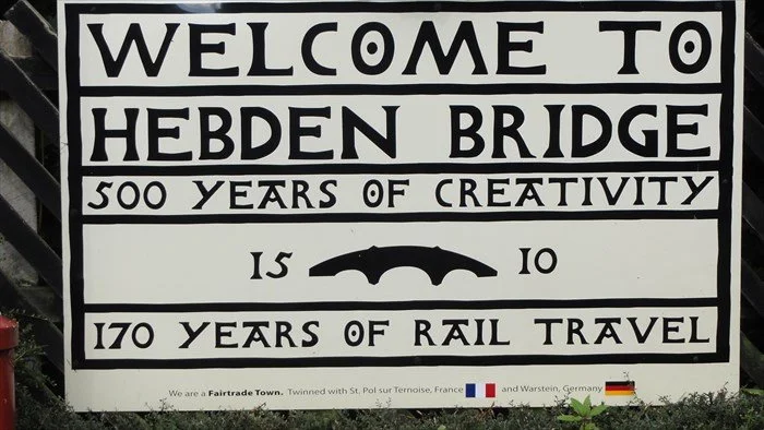
Hebden Bridge, West Yorkshire, is a small mill-town turned creative enclave, often cited for its strong community identity (arts, literature, LGBTQ-friendly) and tourism appeal. While Hebden Bridge’s wayfinding is not a large formal system, the town center does use thematic signage that echoes its artisan character – for instance, brown tourist signs for “Arts Centre” or “Canal Wharf” use a consistent font and occasionally a graphic of a canal narrowboat, tying into the local canal heritage. Hebden Bridge’s main lesson is the use of interpretive maps and trails to get visitors exploring beyond the obvious. The town created walking trail leaflets and mounted map boards guiding people to see the historical mill sites, the canal towpath, and scenic viewpoints. By doing so, they distribute visitors more evenly (preventing overcrowding in just the tiny center) and highlight lesser-known businesses like hillside cafés or craft workshops.
New Brighton could implement similar themed trails – e.g., a “Heritage Trail” from Perch Rock Fort through the old Victorian villas, or an “Art Trail” that leads people to the street art murals and gallery spaces – with the wayfinding signage indicating these routes with special icons. Hebden Bridge also underscores community-led maintenance: many of its signs and notice boards are maintained by volunteers or local civic trusts, which keeps costs down and fosters pride. The New Brighton community, via the Partnership or local volunteer groups, could adopt certain elements of the system (like periodically updating information posters or cleaning signboards), increasing the sense of local ownership.Frederikshavn (Denmark)

Frederikshavn is a small Danish coastal city that, despite its size, achieved international attention through a creative placemaking and branding effort: it developed “Palm Beach” – literally planting palm trees on its city beach every summer to create a tropical ambience in chilly Jutland. This quirky initiative, paired with bright signage and promotion, turned a local beach into a distinctive attraction that differentiates Frederikshavn. While this is more of a branding stunt than a signage scheme, it illustrates the power of a unifying theme and bold visuals for a small town. Wayfinding in Frederikshavn capitalised on this by using imagery of palm trees on directional signs pointing to the beach (so even navigation signs doubled as marketing for Palm Beach). The city also ensured that from the moment you arrive (off the ferry or train), you see references to the Palm Beach – through banners, floor markings, etc., guiding you there.
For New Brighton, which doesn’t have palm trees but has its own unique assets (e.g., the lighthouse, Pirate Festival, the Black Pearl pirate ship driftwood sculpture), thinking about a signature icon or theme to integrate into all signage could yield a similar effect. Perhaps the New Brighton Lighthouse silhouette becomes the marker on all signs, or a colorful wave motif runs through the design, symbolizing both the marine location and the town’s forward momentum. Frederikshavn also teaches us about seasonal identity: New Brighton might consider seasonal banners or temporary signs during peak season that celebrate the town’s theme (for example, summer signage with playful designs that can be removed in winter to preserve them).Summary
In all these small-town cases, a common thread is community-centric design. These towns succeeded by reflecting their local character in the wayfinding system and involving residents in the process. From Totnes’s public consultations to Hebden’s volunteer maintenance, the human element is key. This not only leads to more authentic storytelling in the signage but also helps mitigate challenges (vandalism tends to be lower when locals feel a sign belongs to their community, and content is more accurate when locals have input on what destinations to include).
Big City Lessons: Cohesion and Clarity at Scale
Bristol’s Legible City
No discussion of wayfinding best practice is complete without Bristol’s “Legible City” project – a pioneering, integrated approach launched in the late 1990s that has become a model worldwide. Bristol’s Legible City involved the creation of a city-wide family of pedestrian signage, maps, visitor information points, and transit information, all following a unified design code. The aim was to improve people’s understanding and experience of the city through consistency and connectivity. The project included hundreds of directional signs and on-street information panels with city and area maps, supported by printed maps and even public art installations, all carrying the same visual language.
One outcome was that previously overlooked areas and attractions became more visited because they were clearly highlighted and connected on the maps. For instance, someone arriving at Temple Meads station could see from a Legible City map that a historic church or market was a short walk away and be enticed to go there, whereas before they might not have known about it. The project was rigorously user-tested; surveys later found over half of visitors used the Legible City signage and 97% of those found it helpful – nearly a quarter of visitors relied completely on the signs. This demonstrates the impact good wayfinding can have even in an age of smartphones.
For New Brighton, the Bristol example suggests: invest in high-quality mapping and information design, ensure it’s consistent on every sign (so users instantly recognize a “New Brighton information panel”), and integrate different info types (directional arrows plus area context like “You are in the Victorian Quarter, 5 min from the seafront”). Additionally, Bristol’s system is now being refreshed after two decades, incorporating illumination and digital features – showing that longevity and adaptability were built in. New Brighton’s plan should similarly be seen as a long-term infrastructure investment that can evolve (for example, designing sign structures that have space to add new destinations or QR codes in future). The Legible City philosophy of treating wayfinding as infrastructure – as essential as roads or streetlights for a functioning city – is a mindset worth adopting.Legible London (London’s Pedestrian Sign System)
Inspired by Bristol, London rolled out its Legible London wayfinding system starting around 2007-2010. It addresses the complexity of a huge metropolis by providing clear, standardised pedestrian signage across central London and many boroughs. The key features: map-based monolith signs at frequent intervals, “heads-up” orientation (maps are rotated to match the viewer’s direction, which research found users prefer)slate.com, inclusion of local landmarks and 3D building illustrations on maps (to help people recognise what they see around them)slate.com, and a colour-coded district naming on the maps. Legible London also introduced a terminology now common: the large signs are “Monoliths,” medium ones “Midiliths,” and smaller ones “Miniliths,” to denote their scale. This hierarchy allows the system to be scaled to different neighbourhoods. Importantly, Legible London was evidence-based: user testing showed, for example, that having an index of street names on the map was crucial (initial minimalist designs omitted it, but people wanted it), and that indicating walking times (5 minutes, 15 minutes radius circles) helped change behaviour by revealing many places were walkable in under 15 minutesslate.comslate.com. The outcome has been positive – millions use it daily, and it has even reduced short subway trips as people realise walking is feasible.
For New Brighton, a small town, the direct application is to borrow the clarity and user-centric design principles: use easily understood symbols, ensure every map is oriented the way the user faces (so perhaps one side of a map panel faces one direction, the opposite side another), and consider an index or listing of key attractions on bigger maps. While New Brighton won’t need “miniliths vs monoliths” in the same way, it can emulate the idea of having larger map panels at big decision points (e.g., train station, Floral Pavilion entrance) and smaller directional signs within the quarters.
Manchester’s City-Centre Wayfinding & Branding
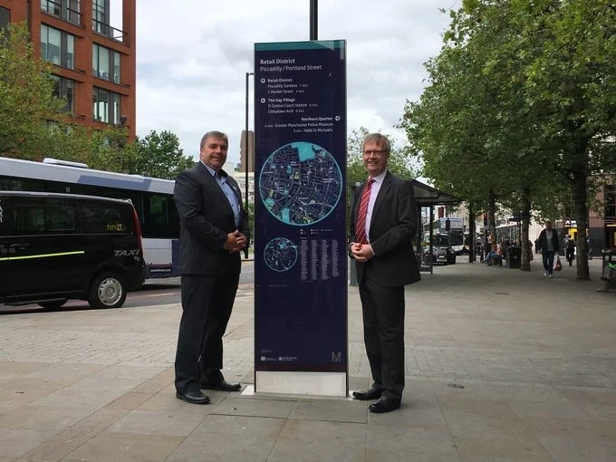
Manchester has undertaken a project called “Manchester Connected Wayfinding” to link its city-center neighbourhoods and transport hubs. Completed in 2019, the project installed 28 eye-catching new totem signs between the major train stations (Piccadilly and Victoria) and across the core, with directions to important historical, cultural, and retail destinations en route. This system, designed in collaboration with Spaceagency, also introduced a fresh city-centre map consistent with the signs’ look, and distributed 250,000 printed maps to businesses and visitor centres to reinforce usage. A notable aspect was decluttering: as the new signs went in, outdated signage was removed to avoid confusion and improve aesthetics. The visual design of Manchester’s wayfinding embraces the city’s branding, including hints of the famous Manchester bee symbol and a vibrant color scheme that reflects Manchester’s energetic culture (as noted by the designers, they aimed to “infuse the pride and energy” of Manchester into the totems so that they act as “representative landmarks” themselves). This shows the power of aligning the graphic design with civic identity – in Manchester’s case, civic pride is very strong (the bee symbolising the industrious and resilient spirit), and the wayfinding graphics tapped into that narrative.
For New Brighton, the takeaway is to ensure the design phase includes input on what symbols or themes resonate locally. Perhaps the New Brighton lighthouse, the anchor, or even the theme of “the New Brighton story of renaissance” could be woven in. Manchester also illustrates operational best practices: they conducted extensive stakeholder engagement (businesses, transport, disability groups) so that the system truly served local needs and used a prototype test on street before mass installation. New Brighton should similarly pilot a sample sign and map in one area (maybe a temporary test during an event) to gather public feedback on readability, content, and attractiveness. Additionally, Manchester’s integration with Transport for Greater Manchester shows the value of connecting transit to walking – their signs connect with tram and bus info and are part of a unified network. New Brighton, as a smaller locale, can at least ensure its train station has the new maps and style, and coordinate with Merseytravel so that any local transit info (like the ferry to Liverpool or bus routes) complements the wayfinding design.Lessons from Transit Hubs (Airports & Stations)
Major transport hubs like airports and big train stations are masters of wayfinding due to necessity – they handle vast flows of people who are often stressed or in a hurry, speaking different languages, etc. They achieve clarity through rigorous design standards that New Brighton can learn from in principle:
Heathrow Airport (London)
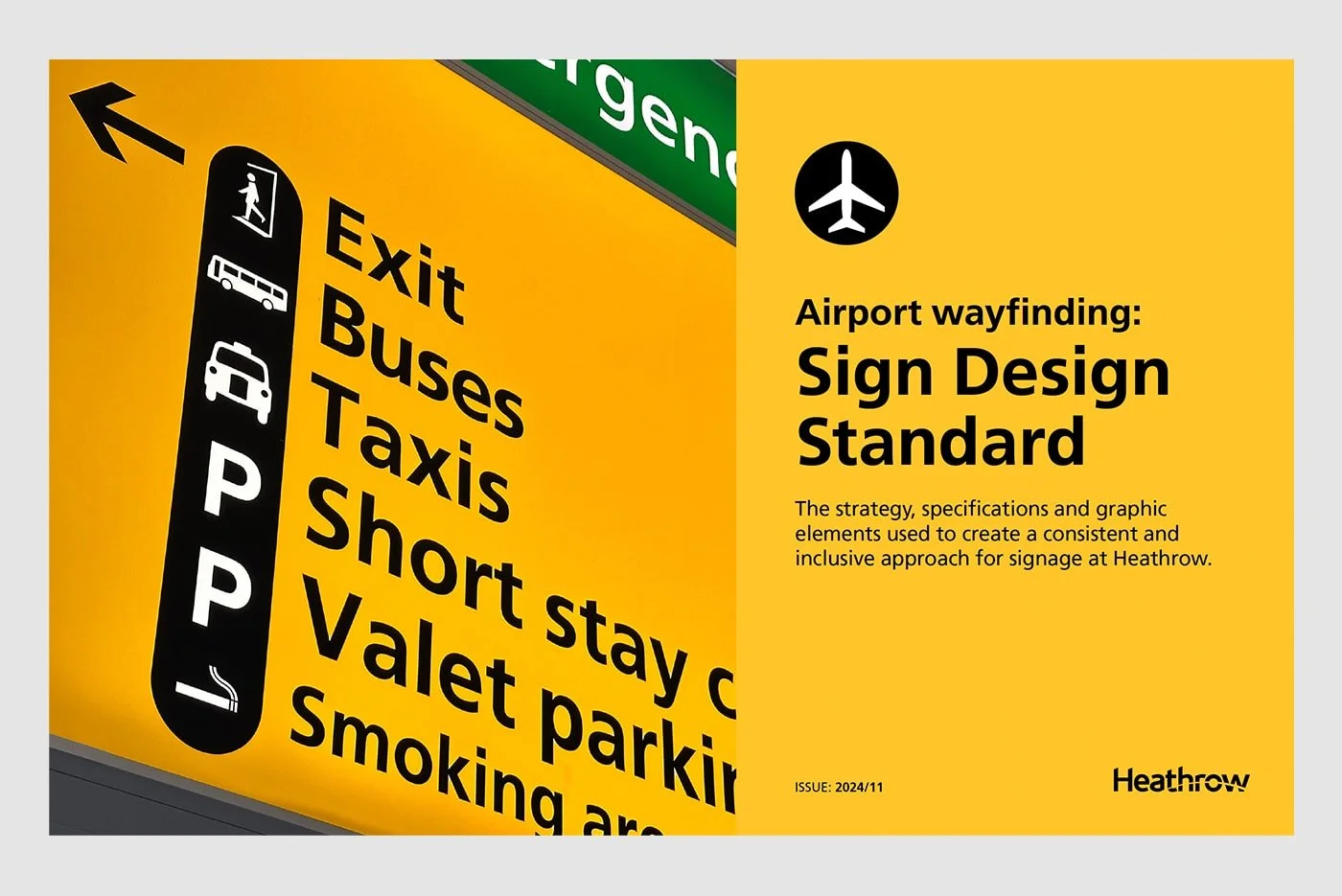
Heathrow’s signage is globally recognised for its clarity – typically black background with yellow text and simple icons for directions, developed initially by legendary designers Kinneir and Calvert for British road signs and adapted to the airport context. Recently, Heathrow undertook a project to unify and simplify its mapping system across all terminals because multiple mapping styles had emerged over time. By creating a single, user-tested mapping standard (with consistent symbols, colors, fonts), and applying it both on physical signs and digital platforms, Heathrow significantly reduced passenger confusion and stress. The premise “a system to reduce stress in a bustling airport” was achieved by ensuring all information is consistent and easy to follow for even an “inexperienced traveller”. The concept of a central database for maps was introduced, allowing Heathrow to generate maps for signs, brochures, websites, and apps from the same data so they never conflict.
For New Brighton, consistency and accuracy are key takeaways – while the town is not as complex as an airport, maintaining a single source of “truth” for all place names and distances (perhaps a GIS-based map that all designers and app developers use) will avoid discrepancies. Also, Heathrow’s emphasis on legibility and accessibility (large, sans-serif fonts, high-contrast colors, and placement at eye level or above) should guide the town’s sign design to ensure readability for all ages and abilities. Finally, Heathrow is pioneering digital integration like wayfinding via smartphones and interactive kiosks that adapt in real-time to things like flight changes. In a town context, real-time info might include things like “next train in 5 min” at a kiosk or “event starting at 2pm today” – something New Brighton can consider via digital notice boards at key spots.Schiphol Airport (Amsterdam)

The wayfinding system at Schiphol, largely designed by Paul Mijksenaar, is often held up as the gold standard in intuitive design. Key features: universal pictograms, a logical numbering system, and color coding (bright yellow signs for main directions, green for secondary). Mijksenaar famously reintroduced pictograms in the 1990s because Schiphol serves a very international crowd and signage needed to transcend language barriers. The result is that even if you don’t speak Dutch (or English), you can follow symbols for baggage claim, exits, toilets, etc. Also, signage is placed exactly where needed – above head height at decision points, visible from afar, as the original Schiphol design by Total Design had established. The consistency is so strong that travelers subconsciously trust the system (you follow the yellow signs knowing they will lead you correctly).
For New Brighton, with an international visitor component (especially day-trippers from nearby cities or abroad via Liverpool), using clear pictograms alongside text can be helpful (for instance, a universally recognised “ℹ️” for information center, or a bed symbol for hotels, etc., on the signs). Moreover, the placement strategy is important: signs should be where people naturally look for them. This might involve mounting certain signs overhead across a pedestrianised street or on building walls at corners – whatever ensures visibility. Good wayfinding anticipates where people might get lost or hesitate and puts reassurance there (e.g., a sign at a fork in the path on the coastal walkway indicating which way back to the town center). Lastly, Schiphol’s system shows the value of a timeless design – the basics of its signage have stayed effective for decades New Brighton’s design should aim for simplicity and durability over trendiness.St Pancras International Station (London)
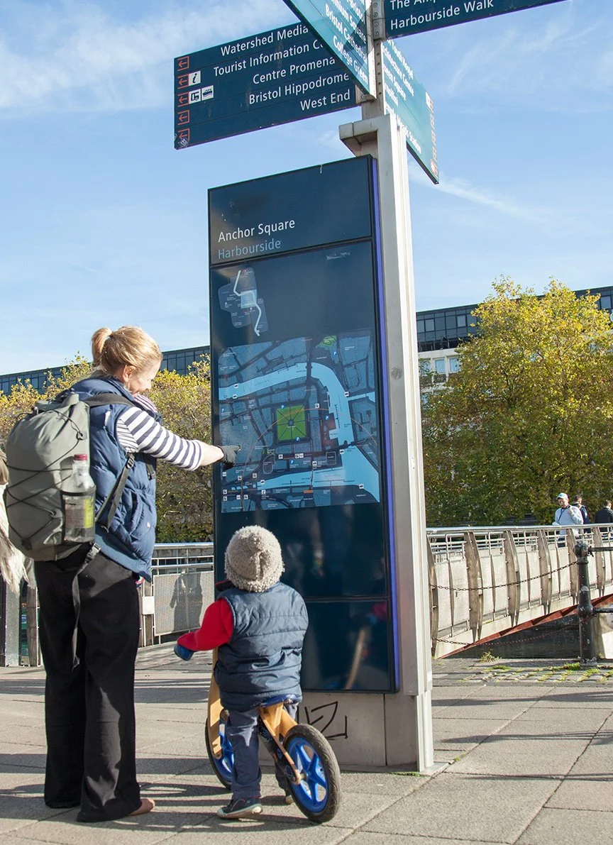
As a complex terminus blending Victorian architecture with modern facilities (and handling Eurostar international trains), St Pancras had to implement signage that meets stringent international travel standards without detracting from the station’s aesthetics. They achieved this by using modern digital wayfinding screens and interactive kiosks for detailed information, while keeping fixed signage minimal and elegant (often using the Network Rail standards for consistency). One innovative step was partnering with a digital map platform (Living Map) to launch a digital wayfinding solution for the station. Via a mobile phone or touchscreens on site, users can search for any shop, service, or platform in St Pancras and get a clear route. The broader point here for New Brighton is: when a place has historical or design sensitivities, sometimes digital can carry the load so that physical signage doesn’t clutter or mar the environment.
New Brighton’s Marine Lake area and promenade have scenic views that we wouldn’t want to litter with too many signposts; a balance can be struck by perhaps having discrete markers that tie into a mobile app or interactive map (so people who want deeper navigation help can get it on their phone). Additionally, multi-language support at St Pancras (given Eurostar passengers) is instructive – New Brighton might consider key info available in other languages via QR code (e.g., scan for a map in French or Chinese), if targeting international tourists.Case Studies and Best Practices - a summary
These best practices from big cities and transit hubs reinforce principles of clarity, consistency, user-testing, and integration of technology – all of which can be scaled appropriately to New Brighton. The idea is not to overwhelm a small town with an overly urban system, but to borrow the ideas that make sense: for instance, using a strong simple design like big cities do, implementing a feedback loop like Manchester did (prototyping and consultation) to get it right, and ensuring the wayfinding system is as much about enhancing experience and confidence as it is about directions. As Patricia Brown of Central London Partnership described Legible London, the goal was for the city to “put a subliminal arm around people”– that is exactly the kind of welcoming, reassuring effect New Brighton should aim for in its wayfinding: a friendly arm around the shoulder of every visitor saying “we’re glad you’re here, let us show you around our town.”

Proposed Approach for New Brighton
Our approach
Building on the insights above, this section outlines a practical approach to implementing a distinctive, visitor-friendly, and community-centric wayfinding system in New Brighton. The recommendations cover branding and visual identity, physical signage strategy, digital integration, sustainability and accessibility measures, and how to weave New Brighton’s unique story into the fabric of the system. The approach is tailored to the town’s scale and character – aiming for high impact without over-complication – and is designed to engage both visitors and residents in discovering New Brighton’s charms.
1. Create a Distinctive and Unifying Brand Identity
Develop a “New Brighton Wayfinding Style” that will be instantly recognisable. This includes a consistent color scheme, typography, icon family, and perhaps a logo or motif, used across all signs and maps.
Given New Brighton’s seaside context and heritage, the branding could draw on coastal blues/greens and a symbol like the New Brighton Lighthouse or an abstract wave. For instance, all signage poles and panels might be painted in a particular shade of blue associated with the town’s identity, with a lighthouse icon and “New Brighton” wordmark at the top of each sign. This echoes Destination by Design’s advice that “signage should reinforce what makes your town unique” – leveraging colors, fonts and materials to reflect local character. Example: If the lighthouse logo is used, a visitor arriving anywhere in town will see that logo on a sign and immediately know it’s an official part of the network guiding them.
Design for identity, not just function. A cohesive visual identity does more than look good – it makes the place more memorable and encourages positive buzz. New Brighton’s brand identity should celebrate its heritage and future: possibly a tagline or slogan could be incorporated (e.g., “New Brighton – Cheshire’s Coastal Gem” or something that evokes its resurgence). However, branding should be tasteful and not interfere with clarity. The graphic design should be handled by professionals who can balance creativity with legibility. The outcome should be that someone could take a photo of a New Brighton sign and immediately know it’s from New Brighton, not any other seaside town.
Unify sub-areas under the brand with subtle differentiation. New Brighton has distinct quarters (the Victoria Quarter creative retail street, the Marine Promenade leisure zone, etc.), which can be given individual identity within the overarching brand. This can be done with color-coding or icons: for example, signage pointing within the Victoria Quarter might have a small “VQ” monogram or a particular color stripe to denote that area, whereas coastal amenities might use a wave icon or a different accent color. This approach allows each quarter to be highlighted (so visitors realise there are multiple areas to explore) but still assures them it’s one unified town. The case of Scarborough did this by highlighting the “cultural quarter” on signs to elevate those sites alongside the beach. New Brighton could mark, say, “Victoria Quarter” on relevant signs so people know when they’re entering that zone and that it’s special (perhaps linking to an area map of that quarter).
Create a signature welcome element. A part of branding is the welcome or gateway signage. New Brighton should install attractive “Welcome to New Brighton” signs at key entry points (the train station entrance, the car approach from Wallasey/Liscard, and the ferry terminal if pedestrian ferries resume). These signs would carry the new branding and set the tone (potentially featuring bilingual info like “Croeso i New Brighton” in Welsh as a nod to regional visitors, or just a friendly slogan). A digital welcome board at the station could also show the day’s events or a key fact about New Brighton (for instance, “Did you know? New Brighton once had the UK’s tallest tower!”). This combines branding with an immediate engagement of visitors. It’s noted that gateway signs can show travelers that the location is more than a nondescript place and pique curiosity – hence investing in a couple of striking gateway signs is worthwhile.
Finally, ensure the brand identity is documented in a design guidelines document (a mini “brand and style guide” for the signage), so that as new signs are added or old ones replaced, everything stays consistent. This guide can detail color codes, fonts (e.g., a clear sans-serif like Transport or Helvetica for text, perhaps a stylized font for the town name in logos), icon usage, and placement rules. This echoes the practice of major systems like Legible London and Bristol, which have manuals to maintain consistency. New Brighton’s guide would be simpler but serves the same purpose: keeping the look and feel uniform, which builds trust (people “trust the system” when signs always appear in the expected format and location).
2. Structure an Intuitive Wayfinding System
Plan the sign locations and hierarchy based on user journeys. A successful wayfinding system should be thought of as a network or “routes”, not a collection of isolated signs.
We should map out the main paths visitors take: e.g., From the train station to the promenade; from the Marine Point car park to Victoria Road; from the Floral Pavilion to the town centre shops; from Fort Perch Rock to Vale Park, etc. At decision points along these routes, place the appropriate signage.
We propose a hierarchical structure:
Orientation Hubs: At major arrival or congregation points, install orientation panels (monolith signs with a map and key info). In New Brighton, candidates are: the Railway Station, the Marine Point entrance (near the supermarket or cinema where people park), the seafront by the Ferry terminal (if applicable) or by the Floral Pavilion, and possibly one at the junction of Victoria Road and Marine Promenade (where people in the creative quarter might decide to head to the beach or vice versa). These panels should have a “You Are Here” map of the whole town with a highlighted 5-10 minute walking radiusslate.com, plus list main points of interest and amenities (toilets, station, etc.). They might also include a few historical tidbits or photos for placemaking flavor. Orientation maps help newcomers get the big picture and plan their exploration.
Directional Signage (Fingerposts and Direction Boards): Along the streets, use fingerpost signs at intersections to point toward key destinations. Each finger could have the destination name and distance or walking time (e.g., “Fort Perch Rock – 5 min” or “Station – 0.4km”). Walking time indicators are strongly recommended, as they have been shown to encourage walking by revealing how close things actually areslate.comslate.com. Key destinations to include are: Marine Point (for those in town heading to the cinema/restaurants), Victoria Quarter (for those on the promenade heading to shops/art galleries), Floral Pavilion, Fort Perch Rock, Lighthouse, Pier (or pier site), Tower Grounds, Marine Lake, Beach, Parking, Toilet, and perhaps Nearby Liscard or Mersey Ferry if relevant. To avoid clutter, not every signpost will list all, but each location will have a sign plan for what to include based on likely needs at that spot. For example, at the station, a sign might have arrows for “Marine Promenade & Beach,” “Marine Point (food & cinema),” “Floral Pavilion Theatre,” and “Victoria Quarter Shops.” Near the Floral Pavilion, signs might point “Toilets,” “Fort Perch Rock & Lighthouse,” “Victoria Quarter via Victoria Rd,” etc. The fingerposts should use the branded colors and fonts, and include small icons where appropriate (a bed icon for hotels area, a knife/fork for food cluster, etc., but keeping it simple).
District or Themed Signs: In areas like the Victoria Quarter, once inside the area, maps or kiosks specific to that quarter can be placed. The Victoria Quarter could have a decorative map sign that lists the independent shops, perhaps maintained by the traders, but still in the same style. Similarly, at Marine Point, a board could show the layout of that complex (many visitors struggle to find say the crazy golf or a specific restaurant in the complex). By integrating those with the wayfinding system, you ensure continuity (e.g., the Marine Point map board uses the same map style, just zoomed in). These sub-maps can tie into storytelling: a Victoria Quarter sign could have a short blurb about the street’s history or its current artsy vibe, deepening visitor appreciation.
Trail Markers: If creating themed trails (heritage trail, art trail, etc.), use markers on pavement or small signs on existing poles. For example, a colored line on the pavement (like a blue line from station to seafront) can subtly guide people (some cities do this for tourist trails). Or numbered trail stops that correspond to a brochure/app. This encourages exploration and can distribute foot traffic.
The layout of information on signs should follow best practices of progressive disclosure – give people the info they need at that point, not everything at once. For example, on a fingerpost at a corner, list the next immediate attractions, not something far beyond that will be signposted later. By planning the system as a whole, we ensure at each stage of a journey the signs “hand off” to the next, so no one feels lost in between. As Mike Rawlinson (of City ID) said about Bristol, you need to model user journeys and predict their needs at each step. We might simulate a few typical journeys (family arriving by car, couple by train, etc.) to test the proposed sign placements cover all their decision points.
Simplify and declutter existing signage. As we introduce the new system, it’s wise to remove or reduce outdated and redundant signs. For instance, if there are multiple different “beach this way” signs of various styles, replace them with one clear fingerpost. Decluttering improves the visual appeal of streets and ensures the new signs aren’t lost in “noise”. The council can do an audit (likely with Partnership input) to identify old signage (like the weathered “What’s On” boards, or confusing parking signs) to be consolidated. In Totnes, the audit revealed confusing multiple signs which they are now consolidating. In New Brighton, we might consolidate, say, the numerous brown tourist signs on the road into one at the main junction with directions to all major attractions rather than scattered ones.
Use multiple languages/accessible text where relevant. While New Brighton’s primary audience is English-speaking, the wayfinding should consider non-English speakers through use of internationally recognized pictograms (as per airports) and possibly secondary language for key messages. Since Wirral has a link to Welsh tourism (coming via North Wales? Though maybe not huge), bilingual English-Welsh isn’t typical there. More useful might be including simple symbols: e.g., an “ℹ️” for information centre, a ferry symbol where the ferry would dock, etc. All text should be in a clear font with sufficient contrast and size to be read by those with moderate visual impairments (following guidelines like UK Department for Transport’s inclusive mobility standards).
Ensure key amenities are signed. Not to forget, signs for practical needs: public toilets, car parks, accessible routes (step-free paths), and emergency info (like lifeguard or RNLI station on the beach) must be integrated. Often, a totem map will have a “Facilities” section or icons on the map for these. Making these easy to find is crucial for a positive experience (nothing is worse for a visitor than not finding a toilet or parking and getting frustrated). For instance, a sign near the promenade should clearly point to the nearest toilets (perhaps with the universal icon) and maybe an indication if they are accessible.
3. Infuse Visual Storytelling and Heritage
Make the town’s story part of the journey. New Brighton’s rich history and culture should be communicated through the wayfinding elements, turning a walk into a heritage tour.
This can be achieved by interpretive signage at points of interest and by incorporating historical images or facts into functional signs. For example, at Fort Perch Rock, alongside directional info, a panel could have a short history of the fort. On the promenade, a series of plaques or creative signboards could tell of the old New Brighton Tower and Ballroom (with perhaps a silhouette marking where it stood). The Scarborough scheme did this effectively by using artwork on their monoliths referencing its spa history – New Brighton can similarly use archive photos (e.g., Victorian bathing machines on the beach, the Tower, the old open-air swimming pool) in small doses on signage to spark imagination.
Leverage public art and unique structures as wayfinding cues. Earlier we noted how Scheveningen and other places use public art as part of navigation. New Brighton already has quirky features – the Black Pearl pirate ship (a community-built driftwood sculpture on the beach) is a landmark that kids love, and murals around Victoria Road catch the eye. The wayfinding plan can formally recognize such landmarks: maps should include them as reference points (“Black Pearl” could be labeled on the promenade map, for instance). Additionally, new art installations could be commissioned specifically to double as place markers. Imagine a series of artistic directional arrows made by local artists, each one themed differently (one could be mosaic with marine life, another metalwork in shape of a ship’s helm) – these would beautify the environment and serve a function. While artistic signposts might be less “standardized,” they can be tied together with the town’s color palette or logo so they’re still clearly part of the official system.
Storytelling trail or scavenger hunt: As part of the interactive experience, New Brighton could create a story trail – for instance, a “Time Traveller Trail” with marker plaques at historically significant spots, each with a QR code to read more or play an audio narration. The Scarborough app’s idea of interactive games is relevant here. New Brighton could have a simple challenge like finding all the murals or answering questions found on info boards (popular with families). This not only entertains but ensures visitors cover all quarters – perhaps starting at Marine Point, then to the Fort, then to Victoria Quarter, etc., collecting bits of a story.
Unifying theme or narrative: Consider framing the wayfinding with an overarching narrative – e.g., “New Brighton Reborn.” Each sign or panel could carry a one-liner about resilience and change (New Brighton’s rise, fall, and rise again as a creative hub). For example, a panel near the Tower Grounds could say “This was once home to New Brighton Tower, taller than Blackpool’s – a symbol of past grandeur” with an old photo, while a panel in the Victoria Quarter might say “Street art and independent shops now bring new life to New Brighton’s old high street – a creative renaissance.” These little narratives instill pride and interest. They transform wayfinding from purely navigation into a self-guided tour that leaves visitors with a sense of New Brighton’s identity and journey.
Consistent messaging tone: The language on signs should be welcoming and clear. Use phrases like “5 min walk to ____” rather than just listing names – it feels more conversational. Perhaps add “thank you for visiting” or similar on exit points. Involve local historians and community leaders in vetting the historical content to ensure accuracy and that we highlight what locals feel is important (as done in Scarborough, where local experts helped uncover facts to put on signs).
Embrace modern heritage: New Brighton’s creative present. Not all storytelling should be about the distant past; celebrate current culture too. If there’s a famous piece of street art, the sign by it can have a blurb about the artist and the community project behind it. Wayfinding kiosks could include an “events this week” section, underlining that the town is vibrant now. Essentially, visual storytelling in New Brighton’s context is showing off everything from pirate radio ships to championship bathing beauties to today’s music gigs at local bars – painting a rich picture that engages a broad audience (families, history buffs, art lovers alike).
4. Signage Types and Technology Integration
A variety of sign types will be used, chosen for context and purpose:
Freestanding Totem Signs: These are vertical panels (perhaps 2.2 meters tall by ~0.7 m wide) with maps and info, placed at key hubs. They should be oriented perpendicular to pedestrian flow for visibility (as in Legible London and others) and possibly double-sided (map on one side, directions on the other). They can include a small “you are here” illuminated dot and be lit at night (either backlit or overhead lighting) for safety. Including walking radii (5-minute circle) on maps is recommended as per London’s practiceslate.com.
Fingerpost Signs: Classic pole with multiple directional arms. Ours will be modern but sympathetic to the environment (maybe black metal poles with colored directional blades that match the brand palette). Use easily readable font and arrows. Possibly include distances or walking time on the blades. Also ensure they’re installed at a height that is above head height but low enough to read (around 2.5m). They should be placed at intersections and any decision point where multiple routes diverge.
Wall-Mounted Signs: In narrow areas or where poles aren’t desirable, use wall-mounted directional signs (e.g., on the side of a building at a corner). These can be flat panels with arrows. This could be useful in the Victoria Quarter where pavement space is tight. They would carry the same design (colour stripe, icon) as fingerposts.
Information Kiosks/Boards: These can be slightly larger boards that might contain a combination of wayfinding and other info (like community notice or historical info). For example, one outside the train station might have a large town map and next to it a space for posters of upcoming events (maintained by the Partnership). Another by the Floral Pavilion could integrate a display of show listings with a town map below it. These kiosks might incorporate digital screens if budget allows, which can cycle through information – for instance, a touch-screen directory of restaurants and their directions, or simply an automated display of “next train times” plus a town map. (As a low-cost start, even a static noticeboard and map side by side provides both wayfinding and community info.)
Digital Wayfinding (App or Web): We recommend developing a simple mobile-friendly interactive map of New Brighton, which could be accessed via QR codes on all the physical maps. Visitors could scan and get a Google-map style interface with key points marked and perhaps augmented reality features (for instance, select a “heritage mode” to see old photos pop up at your location). This doesn’t have to be a native app (to save cost); a responsive web app is sufficient, launched via QR. However, even just embedding the same map graphics into the official “Visit New Brighton” website and ensuring the URL is advertised on signs would extend the reach of the wayfinding. As seen in Scarborough’s plan, a gamified trail in an app can significantly enhance engagement. New Brighton could collaborate with local tech students or an app developer to create something like “New Brighton Explorer” app that has themed walking tours, info on the fly (GPS-triggered facts), and links to local business offers (imagine a notification: “You’re near Vale Park – check out Mother Redcaps gift shop around the corner!”).
Interactive Digital Kiosks: If budget permits, install one or two interactive info kiosks (touchscreen) at high-traffic areas (the train station entrance, or near Marine Point). These could allow users to search for a business or attraction and get walking directions displayed. They can also serve as accessible wayfinding for those with disabilities – by including audio output (text-to-speech) or wheelchair-friendly route options when queried. Such kiosks were mentioned as part of Scarborough’s initiative and are common in airports and malls. They also provide a platform for dynamic content: emergency messages, event promotions, etc. However, they require maintenance and power, so they should supplement rather than replace static signs.
Temporary/Event Signage: Plan for a system of temporary signs for use during special events or construction detours. For instance, if there’s a food festival in town, temporary A-frame signs or flags can be branded similarly and placed to direct attendees from parking to the festival site, then removed after. Keeping the branding consistent even on temporary signs (same color/logo) maintains the seamless experience.
Sustainability considerations
Choose durable, sustainable materials for sign fabrication. Marine environment is corrosive, so powder-coated metals or marine-grade stainless steel (for structural parts) combined with recycled plastic or hardwood from sustainable sources for panels could be used. The South Cliff Gardens project in Scarborough used FSC-certified oak and aluminum for over 100 wayfinding signs, showing it’s feasible to be eco-friendly and robust. We could emulate that by using, say, recycled ocean plastic composite boards for some signage or locally sourced wood for decorative elements. Also consider the carbon footprint: use local manufacturers if possible, and design signs to be long-lasting so they aren’t frequently replaced. Where lighting is needed, use solar-powered LEDs (many modern sign lights can be solar, avoiding wiring and energy use). For example, small solar uplighters can illuminate a totem map at night.
Accessibility measures
New Brighton’s wayfinding must adhere to inclusive design so that it serves people of all ages and abilities. Tactile features like braille or raised text on key signs (especially at orientation points and building entrances) should be included for visually impaired visitors. There could be an audio guide option via smartphone (QR code triggering an audio description of the map). Font sizes will be generous, and color contrast high (dark text on light background or vice versa, tested for colorblind visibility). Pictograms help those with limited literacy. Routes shown should indicate where step-free access is available (e.g., an icon on the map for ramps vs. stairs – if some pathways have steps, an alternate route should be signed for wheelchair users). The “Access for All” principle might also involve providing seating or rest points along walking routes, which, while not signage per se, complements the wayfinding by acknowledging people might need to pause (the Partnership’s initiative for more seating is noted). We can integrate that by locating benches near sign clusters, turning them into mini-rest/info spots.
Maintenance and updates
Design the sign system to allow easy updates. For example, use modular panels that can be replaced if information changes (instead of having to replace the whole sign). If a new attraction opens, we can add a finger on a fingerpost or update the vinyl layer on a map. A small number of “slots” for community updates (like poster cases) on some signs can keep them fresh (similar to how some city wayfinding totems have a section for community events). As Destination by Design emphasises, keeping signage current protects your investment. To facilitate this, maintain a digital file of all map data and content so updates can be reprinted. The Partnership or Council should schedule periodic inspections of signs for damage, graffiti, or faded graphics and have a plan (and budget line) for repair/cleaning. Engaging local businesses in sponsorship can help; e.g., a small plaque “This sign adopted by ___ company” in exchange for them helping with maintenance costs.
5. Sustainability and Environmental Integration
While touched on above, to emphasise: the wayfinding system should align with New Brighton’s environmental goals.
Encouraging walking and public transport use is itself a sustainability win – and our system explicitly does that by highlighting walking routes and linking to transit (the signage will direct people to the train station, to bus stops, and make walking more appealing by clarity). Additionally:
Materials: Use low-impact, weather-resistant materials that fit the seaside context. For example, corten steel (which forms a stable rust-like appearance) could be an attractive choice for some signage structures – its warm color could evoke the red sandstone of Perch Rock Fort and it’s maintenance-free once matured. Recycled or reclaimed wood could be used for signposts in park settings. Minimizing plastics except where recycled content.
Resilience: Coastal weather (wind, salt, sun) is harsh. Ensure all fixings are marine-grade stainless, all graphics are anti-UV coated to prevent fading. Design sign structures to withstand high winds (perhaps using perforated panels to reduce wind resistance for large maps). A sustainable system is one that doesn’t need frequent replacement due to weathering.
Green integration: Consider integrating small planters or green roofs on large sign structures if feasible – it can be purely aesthetic to soften their look and promote biodiversity (for instance, a bee-friendly plant atop a wide info board). This ties into the idea of New Brighton as a “waterfront garden city” vision under Wirral 2040 framework. It’s a creative touch but could make signs double as mini green spaces.
Lighting: If signs are lit, use solar and LED. Also ensure any lit signs are downward-facing or shielded to avoid adding to light pollution by the coast (protecting night skies and not disturbing wildlife). Possibly, only some key maps need lighting; others can rely on nearby streetlights.
Recycling and lifecycle: Plan for the lifecycle – old signs that are removed should be recycled if possible. The design of new ones should allow that in the future (e.g., using mono-material where possible for easier recycling).
By being visibly eco-conscious in our wayfinding (for instance, having a small note “Made from 100% recycled materials” on a sign) we also send a message aligning with modern expectations of destinations.
6. Feasibility and Expected Benefits
Implementing this comprehensive wayfinding and branding system will require investment and coordination, but it promises significant economic, social, cultural, and environmental benefits for New Brighton. This section outlines those benefits, anticipates challenges, and suggests strategies to address them, including potential funding sources and case studies of similar projects.
Economic Benefits
A cohesive wayfinding system is fundamentally an economic development tool. By guiding visitors to explore more and stay longer, it directly supports local businesses. Visitors who might otherwise just visit the seafront could be nudged by signage to wander into the Victoria Road shops or stop for a meal, thereby spreading spending around. According to experts, “Better navigation keeps people in town longer, encourages them to explore more businesses, and drives dollars to local shops and restaurants.” In New Brighton’s context, if even a fraction of the 100,000+ annual visitors to the Fort or promenade can be enticed into the town center for an extra hour, the uptick in local sales could be substantial (think coffee shops, boutiques, etc. getting new customers).
Moreover, a strong place identity and improved visitor experience can attract new investment. When a town looks organized, well-cared-for, and popular, entrepreneurs are more likely to open new ventures (e.g., a bike rental kiosk because signage shows a cycle route, or a new gallery because tourists are roaming the creative quarter). Destination branding studies have shown that “Strong visual branding creates a sense of place... and fosters a positive impression that helps attract investments and new businesses.” New Brighton’s initiative can be marketed as part of its regeneration – essentially advertising that the town is on the up.
In addition, the signage can directly advertise local features: for example, a sign might explicitly highlight “Hidden Gem: Victoria Road Street Art and Cafés this way,” thus promoting that district’s businesses which many tourists might otherwise miss. This aligns with the Destination by Design insight that signage can highlight hidden gems and “drive new traffic” to under-visited areas, distributing economic opportunity more evenly. The Totnes project expects that improved signage will result in visitors spending more time and money and sharing positive remarks on social media (free marketing) – we expect the same in New Brighton. A satisfied visitor is likely to recommend the town or return, contributing to sustained economic health (through repeat tourism and higher visitor loyalty).
Finally, by making walking easier and more pleasant, the wayfinding system could reduce reliance on car travel within the town, meaning visitors might be inclined to park once and then roam on foot for longer. This can increase footfall past more shop windows (as opposed to just driving in and out of a single destination). The improved flow could also justify extending visit hours (if people are confident finding their way even after dusk thanks to lit signs, they may stay for an evening show or dinner).
In summary, the council and stakeholders can expect increased local spending, business growth, and possibly higher rents/property values in revitalized areas due to better foot traffic. As a measure, one could track changes in retail vacancy rates and footfall counts pre- and post-implementation (perhaps using footfall sensors or surveys) to quantify the economic impact.
Social and Community Benefits
For residents, a well-implemented wayfinding system can foster civic pride and community cohesion. When locals see their town center get a facelift with attractive signage that tells their story, it validates their pride in where they live. Community-driven design elements (like involving schoolchildren in art for signs or quoting local historians on plaques) give residents a stake in the project, increasing the likelihood of them promoting and caring for the town’s amenities. Anecdotally, towns that have undertaken such improvements often report a boost in local morale – people feel “our town is worth investing in.” The New Brighton Partnership’s mission is to inspire civic pride, and this project is a concrete realisation of that aim.
The signage system will also improve navigation for residents in daily life – e.g., better signs to parking or facilities help locals as well, especially new residents or those from other parts of Wirral visiting New Brighton. Additionally, as community events occur (like the kite festival or food fairs), having permanent signage infrastructure (like poster display cases and digital boards) means the community can broadcast local activities more effectively, potentially boosting attendance and volunteer engagement.
Another social benefit is safety and stress reduction. Clear wayfinding reduces the stress of being lost or unsure – which is not only a visitor issue but can affect vulnerable locals too (like the elderly or those with cognitive impairments). As Selbert Perkins Design noted, “a well-conceived wayfinding plan… fosters trust and comfort by reducing confusion and stress”. This contributes to a friendlier, more inclusive town atmosphere. For example, a clearly marked route from the train station to the beach that is step-free and well-signed can encourage older residents to take that walk confidently, where before they might have been anxious about navigation or accessibility.
By encouraging walking and exploration, the project also carries health and well-being benefits. Both visitors and locals may walk more (instead of driving short distances), contributing to physical activity. The design will make walking routes more legible and appealing, aligning with public health goals of active lifestyles. New Brighton, with its promenade, is well-placed to leverage this (there could even be signs indicating a “fitness route” or distances for joggers).
Furthermore, the involvement of community groups (history groups, art groups, youth) in developing content can be a unifying process. It provides a platform for intergenerational exchange – e.g., older residents sharing stories that become content on heritage boards, which younger residents help to design or digitize.
Lastly, a better visitor experience reduces the chance of negative interactions (like frustrated tourists asking residents for directions repeatedly or wandering into unsafe areas). It can also indirectly help crowd management – e.g., if too many people cluster in one spot because they don’t know where else to go, that can cause social friction; good signage disperses people more evenly.
Cultural and Place-Making Benefits
Culturally, the unified signage and branding will elevate New Brighton’s profile as a creative, historic, and vibrant place. It effectively creates an “outdoor museum” of the town’s heritage and art, through the interpretive elements we’ll include. This not only educates visitors but also reminds locals of their cultural assets (perhaps some residents aren’t aware of certain historical facts – seeing them on a sign can instill new appreciation). Such interventions often spark further cultural initiatives: e.g., after implementing a heritage trail, towns sometimes see more interest in local history tours or school projects about local heritage.
The improved sense of place can lead to New Brighton being more frequently chosen as a destination for events, film shoots, and so on. Aesthetically pleasing, story-rich environments attract cultural projects. For instance, if the wayfinding makes the town look put-together and highlights scenic spots, a TV crew might find it perfect for a documentary on British seaside towns (free publicity), or event organizers might say “let’s host the food festival in New Brighton, it has the infrastructure to guide visitors around”.
Placemaking is also about creating spots where people linger and interact. The new signage installations can double as mini “places” – for example, a map kiosk with a bench could become a meeting point (“meet me at the lighthouse map by the cinema”). It adds to the town’s social infrastructure. Over time, the imagery or logo may enter the local iconography – people might wear t-shirts with the New Brighton logo or artists may riff on the wayfinding design in their work, further entrenching the identity.
By telling New Brighton’s story compellingly, we also ensure that cultural heritage is preserved and valued. There’s a saying: you can’t value what you don’t know. Once signs highlight the old Pier site or the Open Air Bathing Pool’s past glory, the community and visitors can rally around preserving what remains (like Fort Perch Rock) and honor the intangibles (memories, narratives) of the town. It’s a kind of narrative preservation.
Environmental Benefits
Encouraging sustainable mobility (walking, cycling, public transport) is a core benefit. The signage will make walking routes clear, show distances that often prove walking is quicker for short hops, and indicate where bike routes are. If more people walk or cycle between New Brighton’s attractions (instead of moving cars from one car park to another for each activity), that reduces traffic congestion and emissions within the town. It also makes the promenade safer and more pleasant (fewer cars circling looking for the next destination because they missed a turn).
Better wayfinding to public transport (like clear signs to the Merseyrail station and highlighting connecting bus or ferry services) can encourage visitors to use those modes to come and go, reducing car travel to the town. For instance, a tourist in Liverpool might see at the ferry terminal or online that New Brighton is an easy ferry ride + 10-minute walk due to good signage, and choose that over driving through the tunnel.
As mentioned, the system’s design will be environmentally friendly in itself (materials, lighting). Using solar power for lighting or not needing electricity for most signs means negligible ongoing energy use. And durable design means less frequent replacement, i.e., lower material waste over time.
If we incorporate any nature interpretation (for example, a sign by the marine lake explaining bird species or coastal plants), we also raise environmental awareness. It can subtly encourage visitors to respect the beach and park environments (maybe a reminder on signs: “Help keep New Brighton tidy – bins are marked on the map” etc.). A well-cared-for environment is likely to be better respected by users.
Challenges and Mitigation Strategies
Implementing this project will have challenges, but each can be anticipated:
Funding Constraints: High-quality signage and design expertise come at a cost. Custom totems, especially with lighting or digital features, are not cheap, and the project might require tens of thousands of pounds. Mitigation: Break the project into phases and seek a mix of funding. Phase 1 could focus on a core area (say station to seafront route) to demonstrate impact, then further phases extend to other areas. This makes initial funding more attainable and success can attract more. Pursue external funding: the Coastal Communities Fund and the UKSPF are prime candidates. For example, Scarborough’s project was linked with Towns Fund investment New Brighton could craft a Levelling-Up bid centered on “Connecting New Brighton: signage linking assets to boost the visitor economy and community access.” Also explore the Heritage Lottery Fund (if heritage interpretation is significant) and Business Improvement District (BID) if one exists or could be formed – local businesses might levy funds if they see direct benefit. Case study: In Faversham and Whitstable, council support plus a modest contribution from a county sustainable travel fund enabled their wayfinding project.
Stakeholder Coordination: We need buy-in from multiple parties: Wirral Council departments (planning, highways), local businesses (whose building might host a sign or whose footfall patterns may change), Merseytravel (for integration at the station), etc. There may be differing opinions on design or placement (e.g., a shopkeeper might not want a sign outside their window). Mitigation: Start with a stakeholder workshop early – present the concept, show best practice examples, and importantly, incorporate stakeholder feedback in the design process. Emphasise the benefits (footfall increase, etc.) to businesses to get them on board. For residents, hold a small exhibition or online survey about design choices (Totnes did a public consultation, which is a good model). Building consensus early will smooth permissions and reduce NIMBY objections. Also, have the council formally endorse the masterplan for signage, so that highways and planning processes support it (this avoids sign applications being bogged down in bureaucracy later).
Heritage and Aesthetic Concerns: In historical areas, heritage officers might worry that new signs could be visually intrusive (especially if modern-looking). Likewise, some residents might prefer a traditional style. Mitigation: Engage the council’s conservation team in the design phase – perhaps choose a slightly different aesthetic for the conservation areas (e.g., more traditional fingerposts in the oldest parts, and contemporary totems in modern areas). We can also point to other heritage towns that have done this tastefully. Additionally, ensure any fixings to listed structures are done with proper consent and minimal impact (or use freestanding where possible instead of attaching to old buildings). By demonstrating sensitivity (maybe even having the sign legs in a color that complements Victorian architecture), we can turn heritage folks into allies.
Maintenance and Vandalism: Coastal weather and potential vandalism (like graffiti or sticker posting) could deteriorate signs. Also ongoing maintenance costs might be a concern for the council. Mitigation: Use anti-graffiti coatings on sign surfaces for easy cleaning. Involve community (possibly adopt-a-sign programs or volunteer “friends of the promenade” to report damage). The Partnership can potentially coordinate maintenance if given training/funding, relieving some burden from the council. Also plan a maintenance fund as part of the project – often grant applications can include a 5-year maintenance sum. By designing out easy targets (e.g., using tamper-proof bolts, avoiding blank surfaces that invite graffiti by instead having engaging content on them), and ensuring things like digital kiosks are robust and securely installed, we reduce issues. If a particular type of minor vandalism becomes common (say sticker tagging), the approach could be to create a sanctioned space for community expression (like a noticeboard or mural wall) to divert such impulses.
User adoption and behavior change: There’s always a risk that people won’t use the signs (especially if they’re used to Google Maps or if locals ignore them). Mitigation: Make the signs unmissable and intuitive. Place them where people naturally pause or look around. Ensure they are kept up-to-date (nothing undermines trust like an out-of-date map or a directional arrow to a closed attraction). Also, do a small marketing push at launch: for example, a local press release “New Navigational System unveiled in New Brighton” inviting people to come try the new heritage trail, etc. Possibly do guided walks to introduce the signage. Over time, as visitors use them and locals see that, locals will also become interpreters – e.g., a local might start their conversation with a visitor asking directions by saying “Have you seen the new map over here? Let’s have a look.” Essentially, allow a transition period and encourage usage.
Integration with Future Developments: New Brighton might have other developments coming (e.g., the Marine Promenade Masterplan suggests changes in the area like new attractions or reconfigured spaces). Signs put up now might need altering if a site is redeveloped or a road rerouted. Mitigation: Coordinate with known plans (if the masterplan is approved, align sign locations with future public realm designs). Design signs to be movable if needed (not too permanent foundations in areas slated for change soon). Keep close contact with the regeneration team so wayfinding is considered in any planning applications for new builds (embedding it in s106 agreements if possible for developers to contribute to signage). The benefit of a flexible, modular system is key here.
By addressing these challenges proactively, we can ensure the project is delivered on time and delivers its intended outcomes.
7. Conclusion and Recommendations
New Brighton stands at an exciting threshold: with its ongoing regeneration and burgeoning creative scene, the town has the ingredients to thrive as a vibrant seaside destination. A comprehensive, cohesive wayfinding and branding system is the connective tissue that will bind these ingredients together – creating a seamless experience from the moment someone arrives, to the moment they leave with positive memories and maybe an extra purchase or two from a local business.
This study has shown how effective signage and strong place identity can be transformative. By introducing a unifying visual identity and logical navigation aids, New Brighton will significantly enhance its local economic growth, tourism appeal, and community pride:
Economic Growth: Visitors who can easily discover all corners of the town are more likely to spend more time and money. The proposed system will spread foot traffic to retail streets and lesser-known attractions, supporting businesses year-round. A welcoming, navigable environment also encourages repeat visits and attracts new businesses (who see a town investing in itself). In essence, wayfinding is an investment with one of the “most effective ROI… hiding in plain sight,” yielding returns through increased spending and visitor satisfaction.
Tourism & Visitor Experience: A cohesive wayfinding scheme will make New Brighton more visitor-friendly than ever. It will reduce the friction of getting around, allowing tourists to focus on enjoying the scenery, shops, and attractions rather than worrying about finding them. As seen in other destinations, this leads to better reviews, word-of-mouth, and repeat visitation. The system will effectively act as a 24/7 ‘tour guide’ – telling the town’s story, highlighting must-sees, and ensuring no visitor leaves saying “I wish I had known that was there.” This improved experience is crucial for New Brighton to compete with other day-trip destinations. It will distinguish New Brighton as a well-organised, story-rich, and charming place – a place people will rave about.
Community Pride and Cohesion: For residents, seeing their town’s identity celebrated on every street corner – through the motifs, heritage tidbits, and the mere fact that confusing old signs are replaced with attractive new ones – will instill pride. It signals that New Brighton is not being left to decay, but is moving forward. The inclusive process of creating this system (with community input on design and content) has already built consensus around a common vision of the town. And when in daily life residents use the maps or direct visitors to the nearest café with confidence thanks to clear signs, it fosters a sense of ownership and hospitality. New Brighton can become known as a welcoming community, which in turn reinforces civic pride.
Place Attractiveness: A unified signage and branding scheme will tie together the disparate physical improvements happening across the town – from new developments on the promenade to the artistic revival on Victoria Road – under one banner. This creates the impression of a cohesive destination rather than scattered attractions. The visual appeal of the signs themselves (with quality design and possibly artistic elements) will enhance the streetscape, making walking around more enjoyable (even “Instagrammable” – visitors might photograph a beautiful sign or mural map as part of their experience). By telling New Brighton’s unique story at every turn, the town differentiates itself from any other resort. It’s not just “any beach” – it’s New Brighton, with this history, these quirky facts, and this forward-looking community. That strong sense of identity can be leveraged in marketing as well – the branding on the wayfinding can extend to brochures, websites (e.g., a matching design on Visit New Brighton site), merchandise, etc., reinforcing the attractiveness in all channels.
In concluding, this study enthusiastically recommends that Wirral Borough Council and partners proceed with implementing the comprehensive wayfinding and signage strategy for New Brighton. It is a relatively low-cost, high-benefit intervention that aligns perfectly with broader regeneration objectives and community desires. The evidence from other towns and cities is clear: when people find their way easily and feel a sense of place, they form a stronger connection and are likely to stay longer, spend more, and return. In New Brighton’s case, the wayfinding system will act as the glue between its historic charm and its future potential – connecting the past (heritage), present (current businesses/attractions), and future (upcoming developments) into one compelling narrative that visitors and locals can navigate and enjoy.
Thus, by approving and funding this initiative, the Council will be taking a concrete step towards making New Brighton not just a pass-through coastal suburb, but a destination in its own right – a legible, lively seaside town that proudly guides you through its streets and stories. It’s an investment in infrastructure, yes, but more so an investment in New Brighton’s identity and prosperity.
Next Steps
It is recommended that a project steering group be established (including Council officers, New brighton Creative Futures, Focal Point, New Brighton Partnership members, local business reps, and design experts) to move forward with detailed design and implementation. An early action should be securing funding – preparing bids for external funds as outlined, while allocating any seed funds for design work. Concurrently, a professional wayfinding design agency (with experience in town/city wayfinding) should be commissioned to develop the visual identity and location plan, building on the concepts in this report. Community engagement should continue through the design phase to fine-tune the system to local needs. Finally, installation can be phased, ideally with an initial rollout in time for the summer tourist season (to maximize immediate benefits).
In conclusion, New Brighton – bright future, clear direction. By introducing a cohesive wayfinding and branding system, New Brighton will quite literally put itself on the map as an inviting, navigable, and distinctive place to live, work, and visit. Let the journey begin – with signs that not only say “You Are Here,” but also celebrate “Here is New Brighton!”
Report by Rory Wilmer, Creative Director, New Brighton Creative Futures.
8. References and Appendices
References:
Wirral Council & BDP – New Brighton Marine Promenade Masterplan (2024) – notes New Brighton’s distinct Victoria Road Quarter and need to improve links between key areas.
New Brighton Partnership – Community Initiatives – highlights local efforts for better signage and community improvements newbrightonpartnership.com.
Destination by Design – Wayfinding Signage for Economic Development (2025) – outlines how well-planned signage boosts local economies, visitor stays, and local pride destinationbydesign.comdestinationbydesign.comdestinationbydesign.com.
Selbert Perkins Design – Wayfinding, Placemaking, Branding in Education (2022) – provides definitions and the impact of wayfinding on reducing stress and fostering positive experiences selbertperkins.comselbertperkins.comselbertperkins.com.
The Guardian – “Are better signs the secret to a successful city?” (2014) – discusses the Legible Cities movement, Bristol’s project and its evolution into Legible London theguardian.comtheguardian.comtheguardian.com.
Applied Information Group – Walk Brighton project (n.d.) – case study on Brighton & Hove’s unified wayfinding system reflecting the city’s brand across print, signage, and digital appliedinformation.groupappliedinformation.group.
Scarborough News – New Wayfinding Signs Installed (2021) – news on Scarborough’s installation of totem signs with maps, integrated with digital kiosks and a wayfinding app thescarboroughnews.co.ukthescarboroughnews.co.uk.
Placemarque Blog – Scarborough Wayfinding (2021) – insight that Scarborough’s signs include heritage artwork and aim to connect town center, seafront, and cultural sites placemarque.complacemarque.com.
Totnes-Today – Signage consultation in Totnes (2021) – details how confusing signage was addressed through an audit and community consultation, aiming to increase visitor spend and heritage awareness totnes-today.co.uktotnes-today.co.uk.
Healthia Services – Bristol Legible City Review (2020) – reveals survey stats that 97% of visitors who used Bristol’s signage found it helpful, and identifies needs like better linkage between areas and stronger neighborhood identities healthia.serviceshealthia.services.
Weston Williamson + Partners – Manchester Wayfinding (2019) – describes the new Manchester city-centre wayfinding project (28 signs linking stations, new maps, decluttering) and design collaboration focusing on city pride wwparchitects.comwwparchitects.com.
Total Design – Schiphol Airport Signage History (2023) – notes how Schiphol’s 1990s wayfinding redesign by Mijksenaar introduced pictograms for multi-language clarity and maintained the legacy of clear, color-coded signage totaldesign.com.
(Appendices with full-size design mockups, maps, sign location plans, and community survey results would be included in a full report, illustrating proposed designs and providing additional data to support the above content.)